
2020
MEDITHERAPY
MEDITHERAPY
메디테라피
CLIENT. Meditheraphy
︎ Branding
︎ Design Strategy
︎ Design Strategy
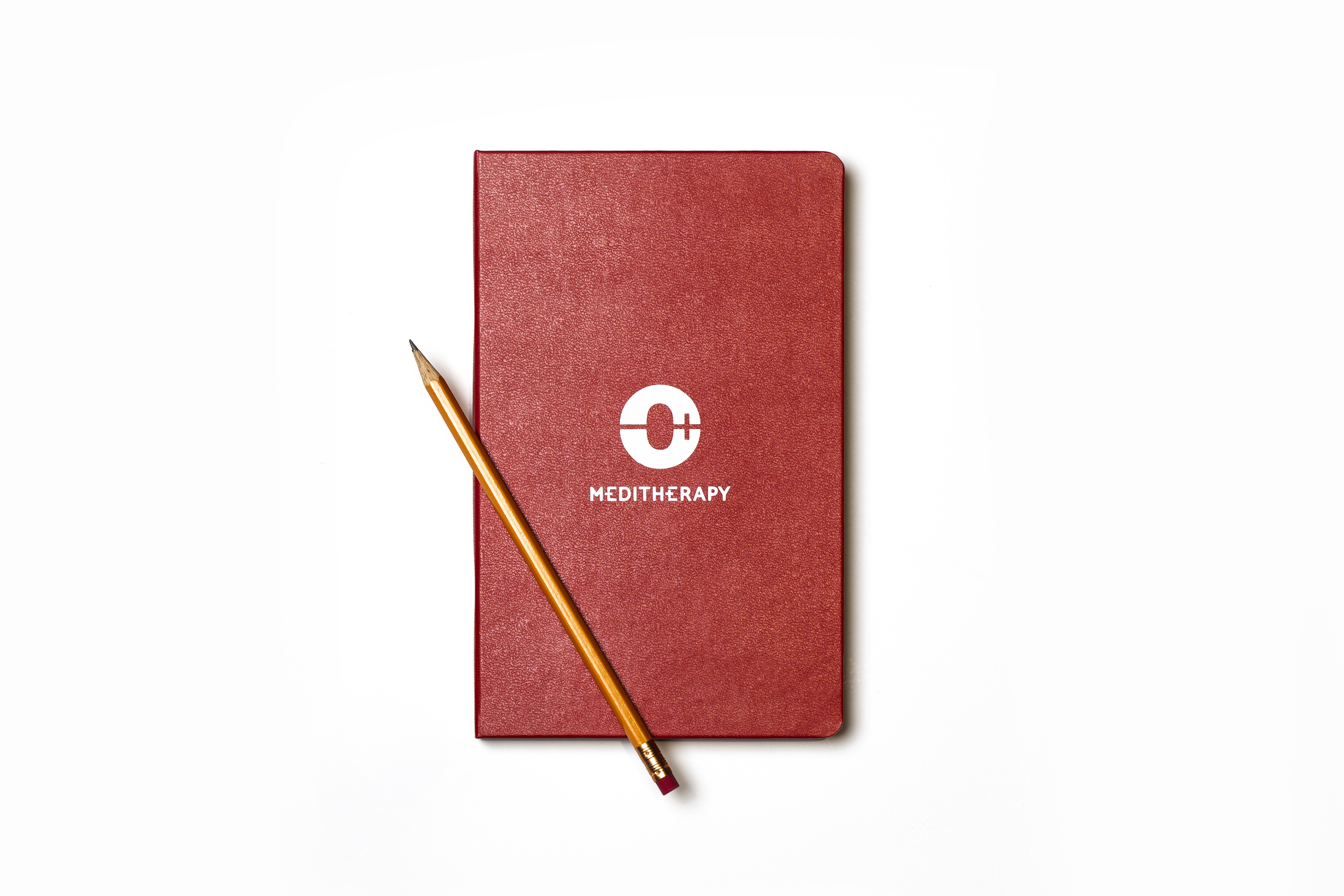
OVERVIEW. 메디테라피의 심볼은 브랜드의 핵심 키워드인 순환을 반영하면서 이를 정교하게 시각화하였습니다.
‘순환'을 의미하는 동양적인 태극 문양의 음과 양을 ‘-’, ‘+’ 기호로 치환해 태극 문양을 보다 현대적으로 해석하였습니다. 단독으로도 훌륭한 상징성과 미학을 담은 본형 심볼은 서식류, 홍보물류, 사이니지, 기타 상품 등 오프라인 적용에 용이할 뿐만 아니라, 각종 온라인 매체에서도 다양하게 적용될 수 있도록 개발되었습니다.
‘순환'을 의미하는 동양적인 태극 문양의 음과 양을 ‘-’, ‘+’ 기호로 치환해 태극 문양을 보다 현대적으로 해석하였습니다. 단독으로도 훌륭한 상징성과 미학을 담은 본형 심볼은 서식류, 홍보물류, 사이니지, 기타 상품 등 오프라인 적용에 용이할 뿐만 아니라, 각종 온라인 매체에서도 다양하게 적용될 수 있도록 개발되었습니다.
A new symbol of Meditherapy accurately visualized the brand keyword, ‘circulation’ by replacing the yin and yang of the Taegeuk symbol with minus(-) and plus(+). The main symbol with perfect symbolism and aesthetics alone has been developed - not only to be easily applied offline materials, such as stationery, promotional materials, signage, and other products, but also to be applied in various online media.


RELATED WORKS ︎︎︎
VIEW OTHER WORKS I COMMUNICATION ︎︎︎
WE ARE HERE
Current time
베리준오 디자인센터
VJO Design Center
3F, 43, Mallijae-ro 35-gill, Jung-gu, Seoul, Korea
서울 중구 만리재로 35길 43, 3층 (04502)
+82 2 312 0280
hello@vjo.kr
베리준오 브랜드아키텍처
VJO Brand Architecture
베리준오 제주 아뜰리에
VJO Jeju Atelier
Jeju, South Korea
Design in Progress
© VJO. All rights reserved.