
2023
PEACE FOREST WORK
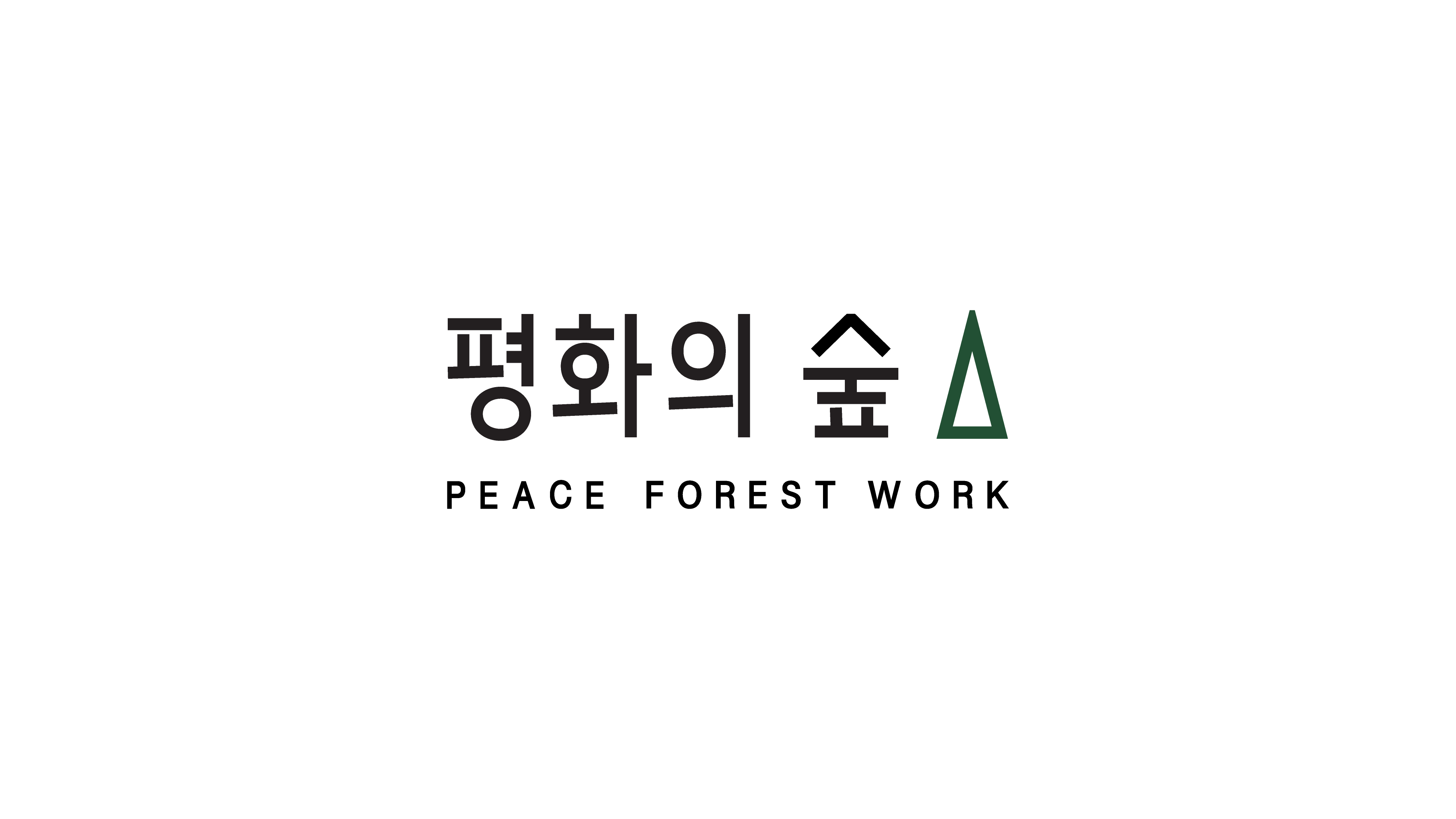
평화의 숲
CLIENT. Peace Forest Work
︎ Branding
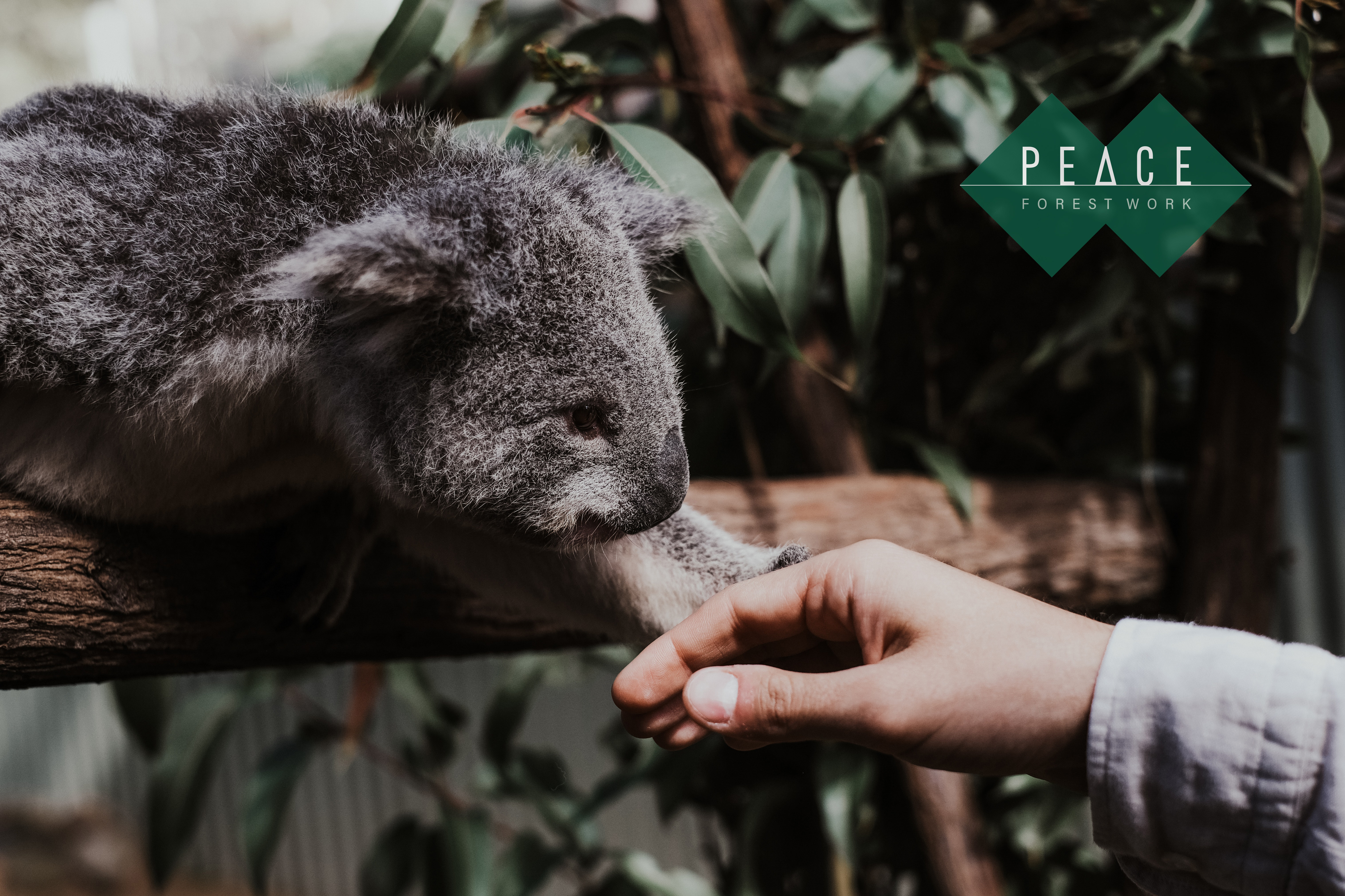
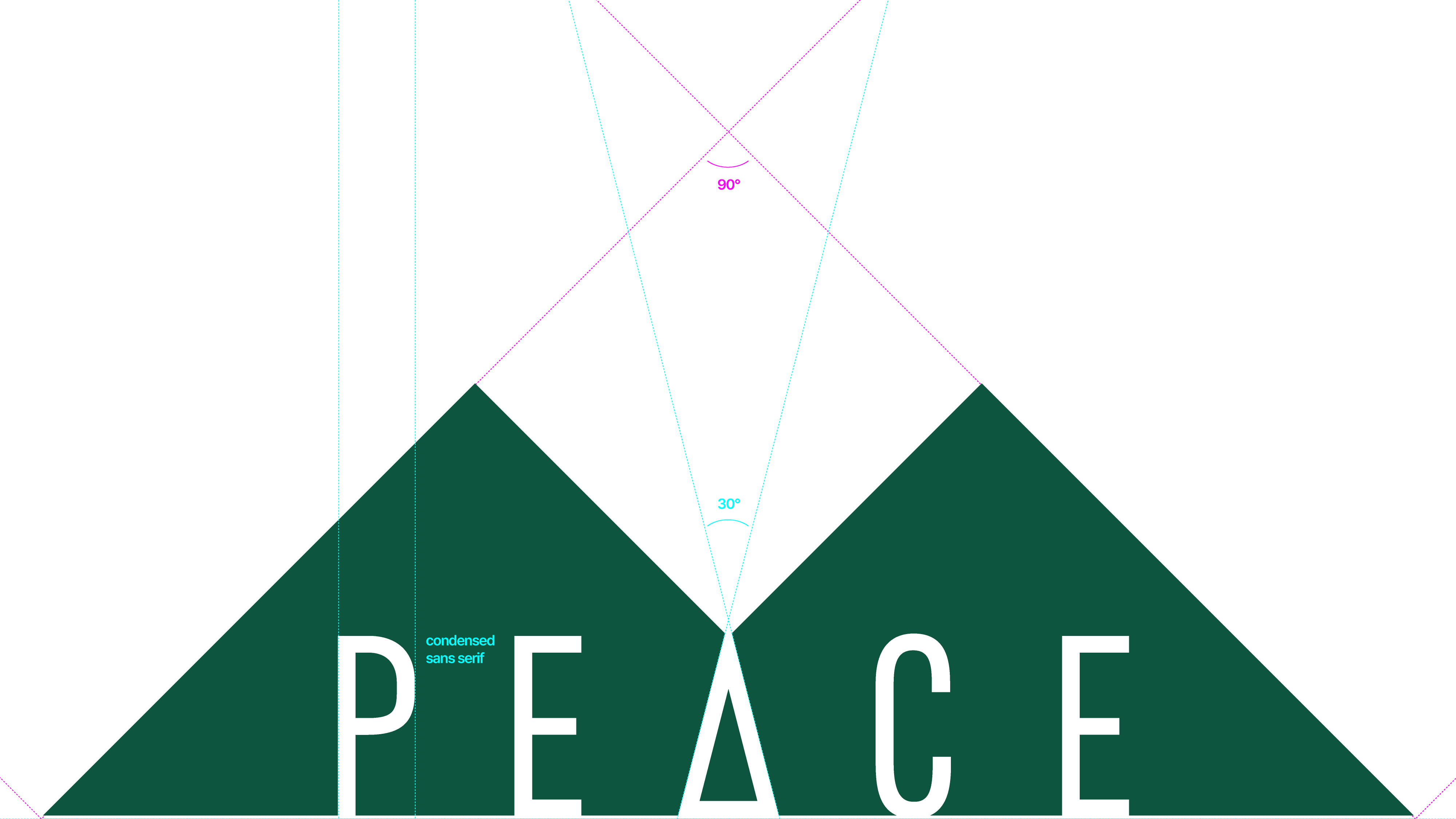
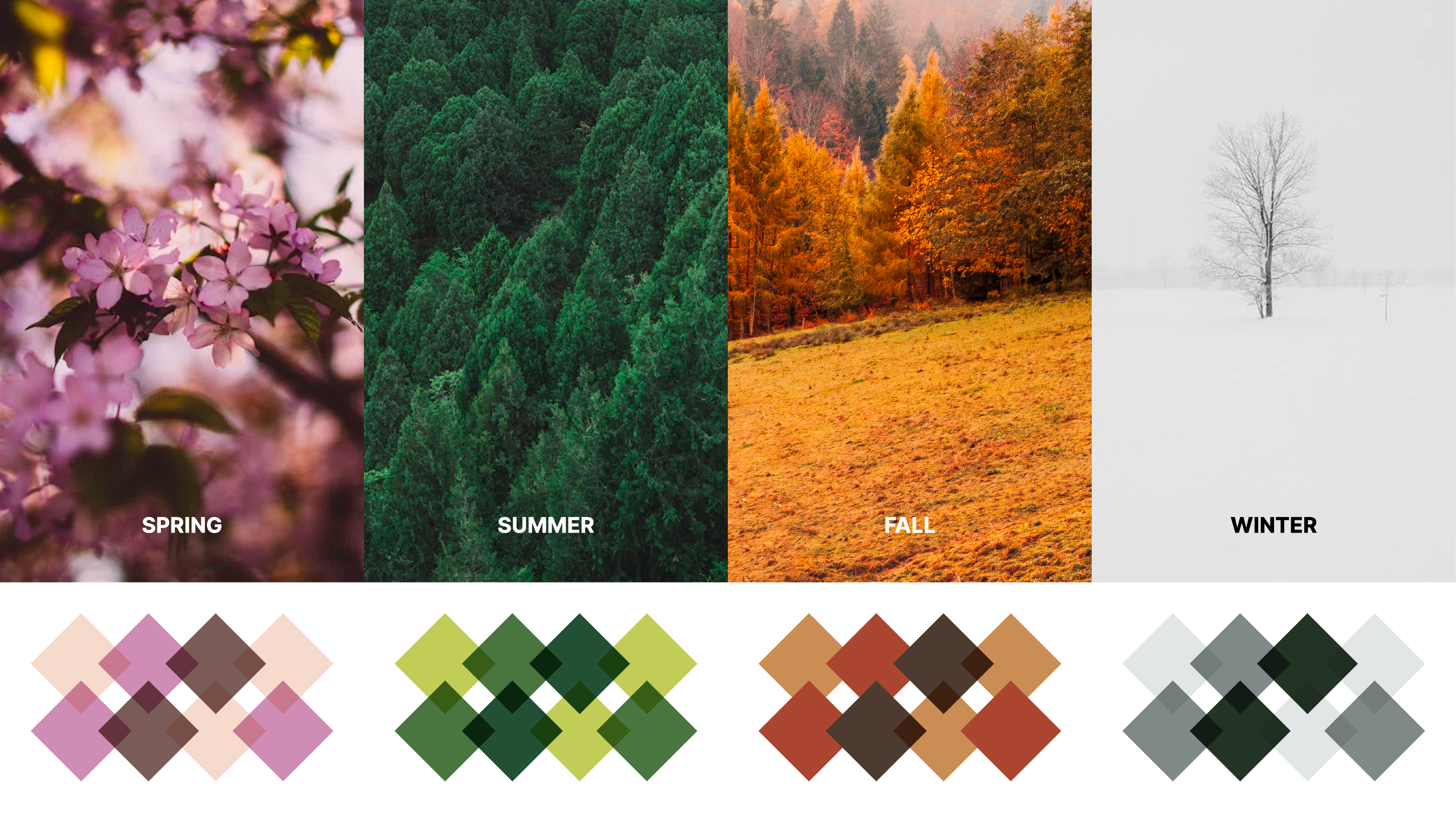
OVERVIEW. 기존 일체감이 부족했던 로고를 크기에 관계 없이 가독성이 좋고 단순하여 시인성이 좋은 로고로 리뉴얼하였습니다. 평화의숲 새로운 로고는 산과 호수에 비친 산의 모습을 단순하게 형상화한 심볼로 직선으로 이루어져 정제된 인상을 부여했으며, 로고의 그래픽 요소를 활용한 패턴으로 다양하게 확장이 가능한 시스템을 구축했습니다.
VJO renewed the previous logo that lacked a sense of consistency to a readable and simple logo with better visibility regardless of its size. Giving a refined impression, the new logo of Peace Forest Work is a symbol of the mountain reflected in the lake. We designed a system that could iterate in various ways utilizing patterns made out of graphic elements of a new logo.
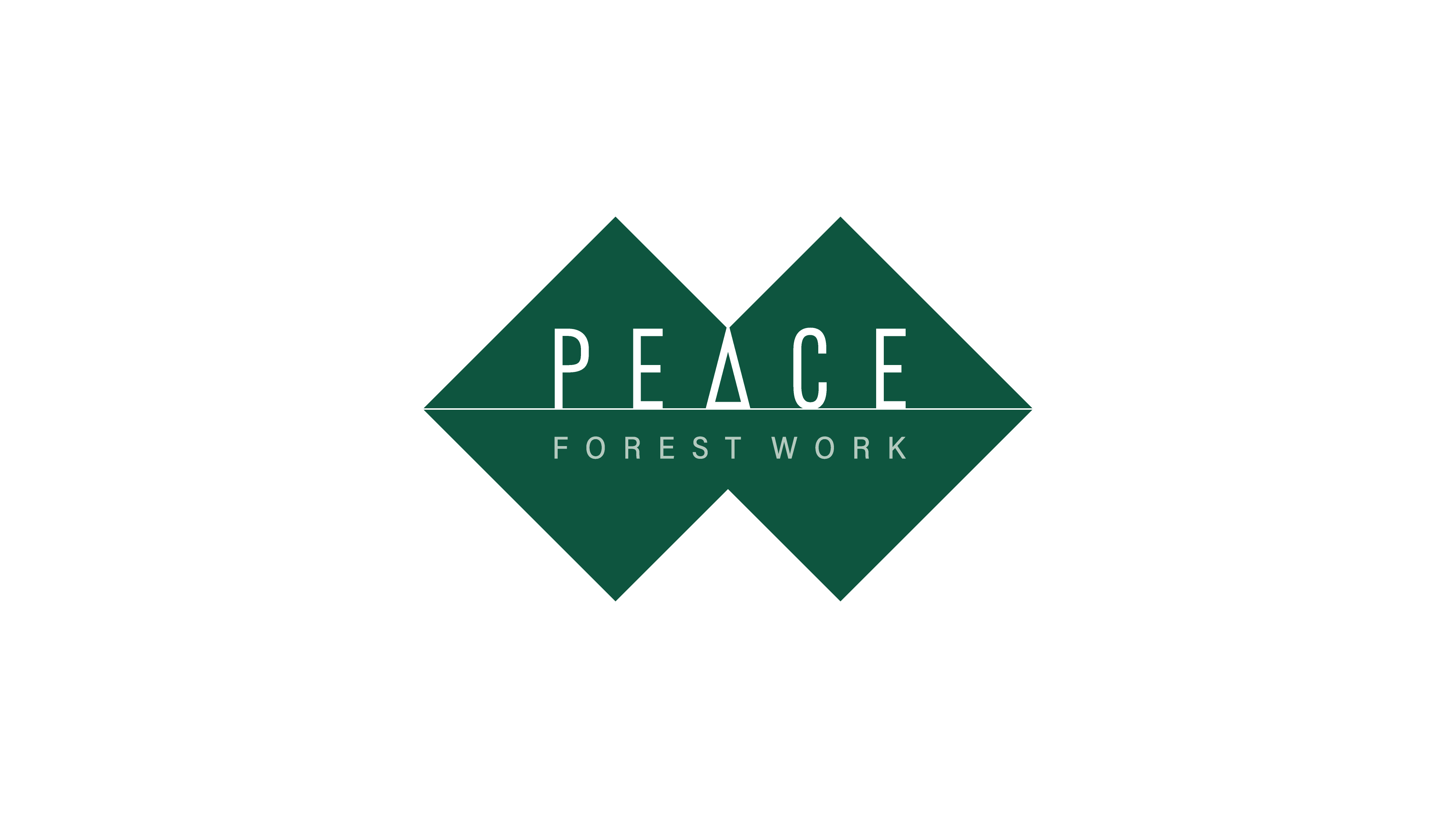
New Logotype I En
New Logotype I Kr
Pattern & Color Scheme
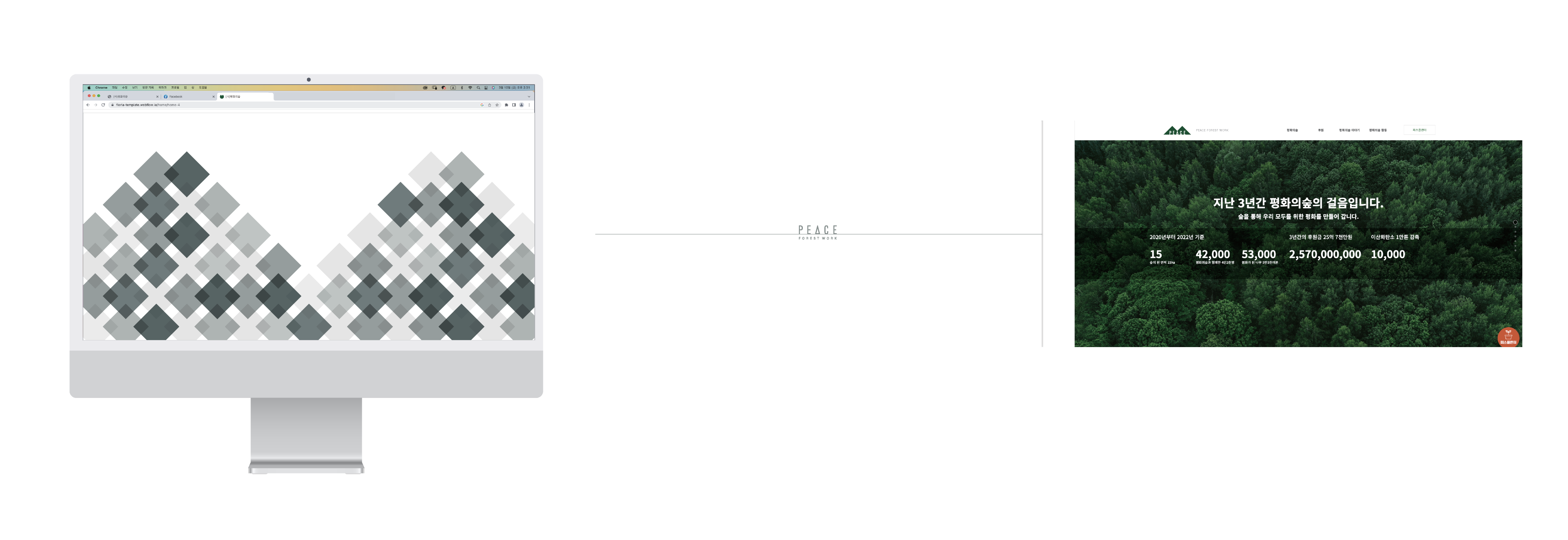
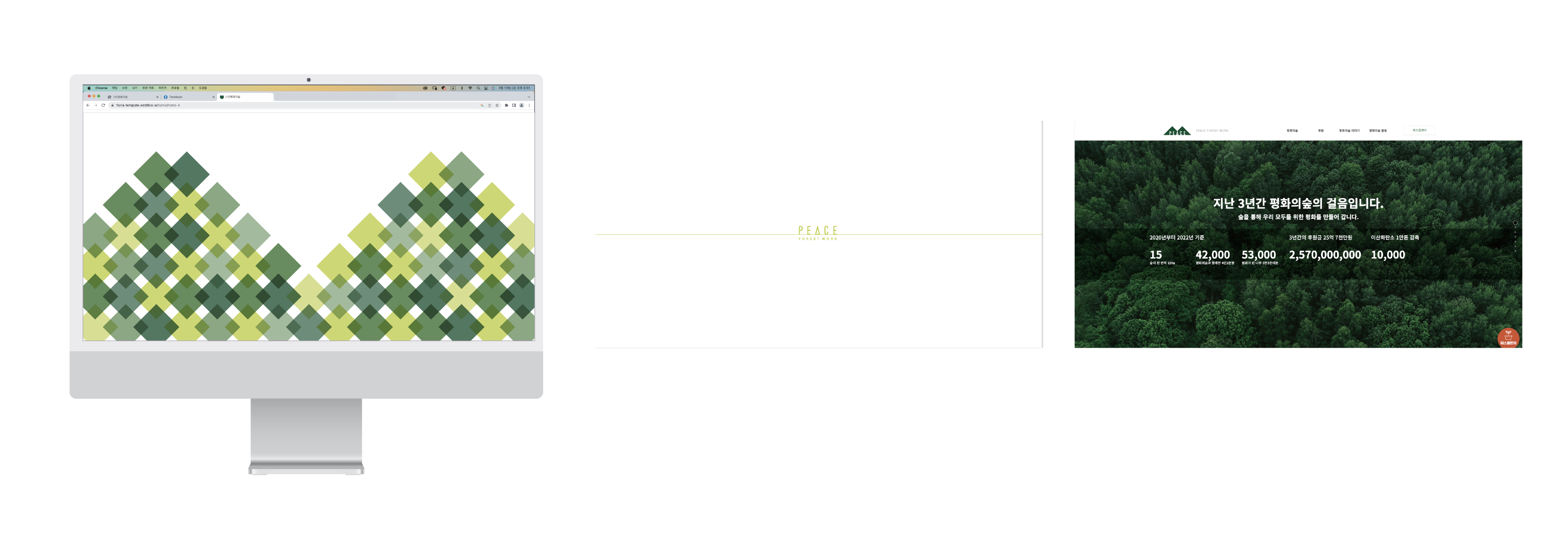
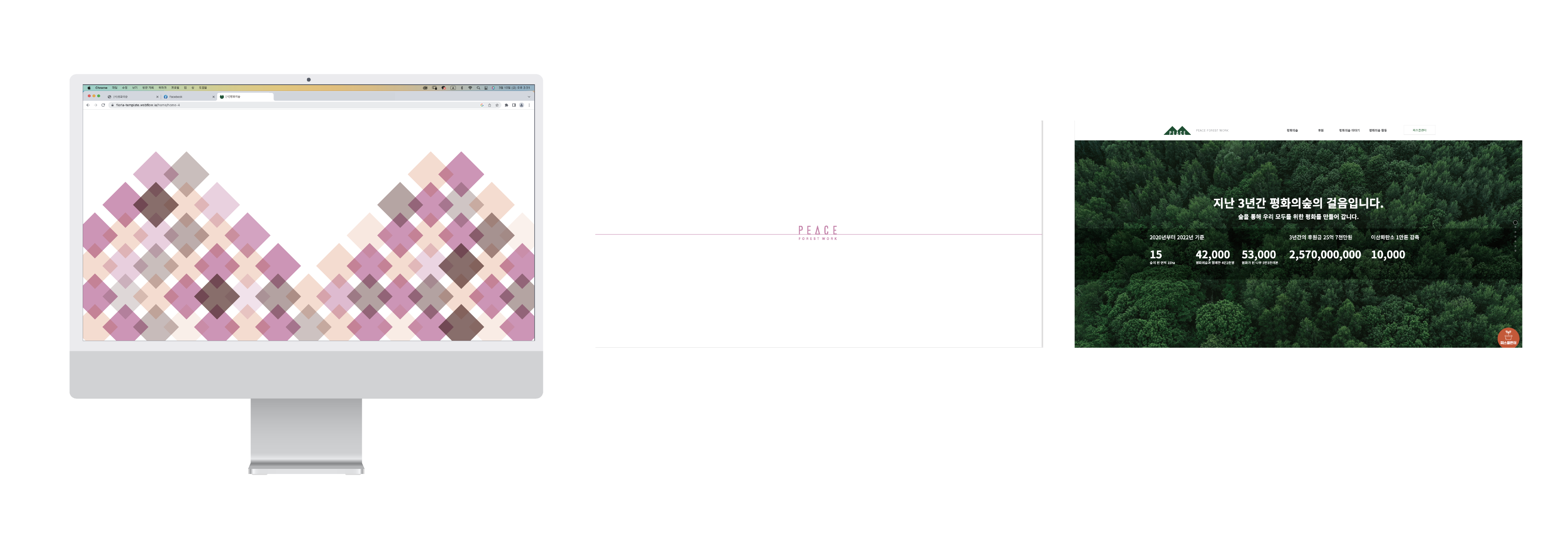
Website landing page

VIEW OTHER WORKS I COMMUNICATION ︎︎︎
WE ARE HERE
Current time
베리준오 디자인센터
VJO Design Center
3F, 43, Mallijae-ro 35-gill, Jung-gu, Seoul, Korea
서울 중구 만리재로 35길 43, 3층 (04502)
+82 2 312 0280
hello@vjo.kr
베리준오 브랜드아키텍처
VJO Brand Architecture
베리준오 제주 아뜰리에
VJO Jeju Atelier
Jeju, South Korea
Design in Progress
© VJO. All rights reserved.