
2024
SUSTINVEST REBRANDING
서스틴베스트 리브랜딩
CLIENT. SUSTINVEST
︎ Branding
︎ Design Strategy
︎ Design Strategy
OVERVIEW.
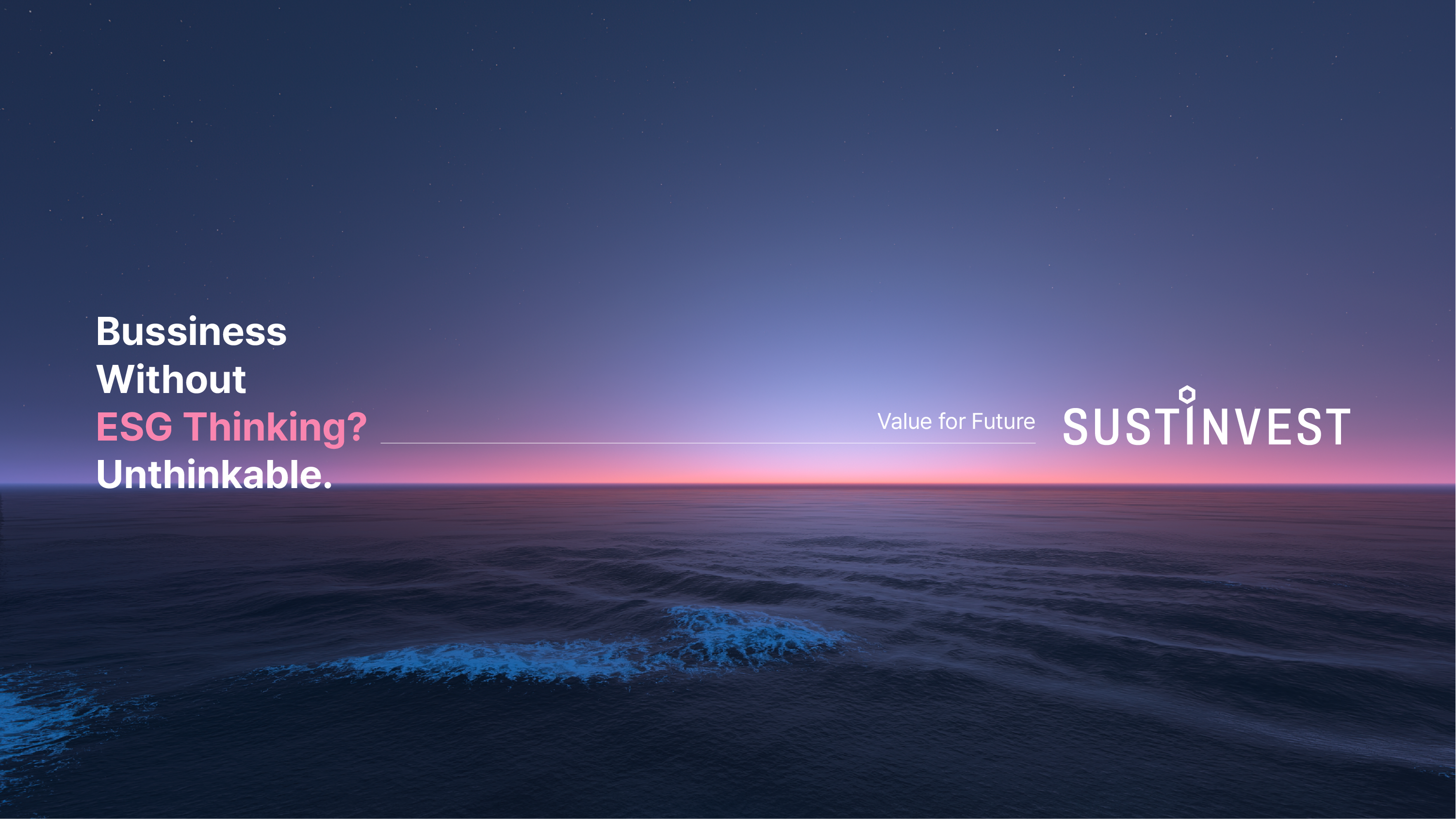
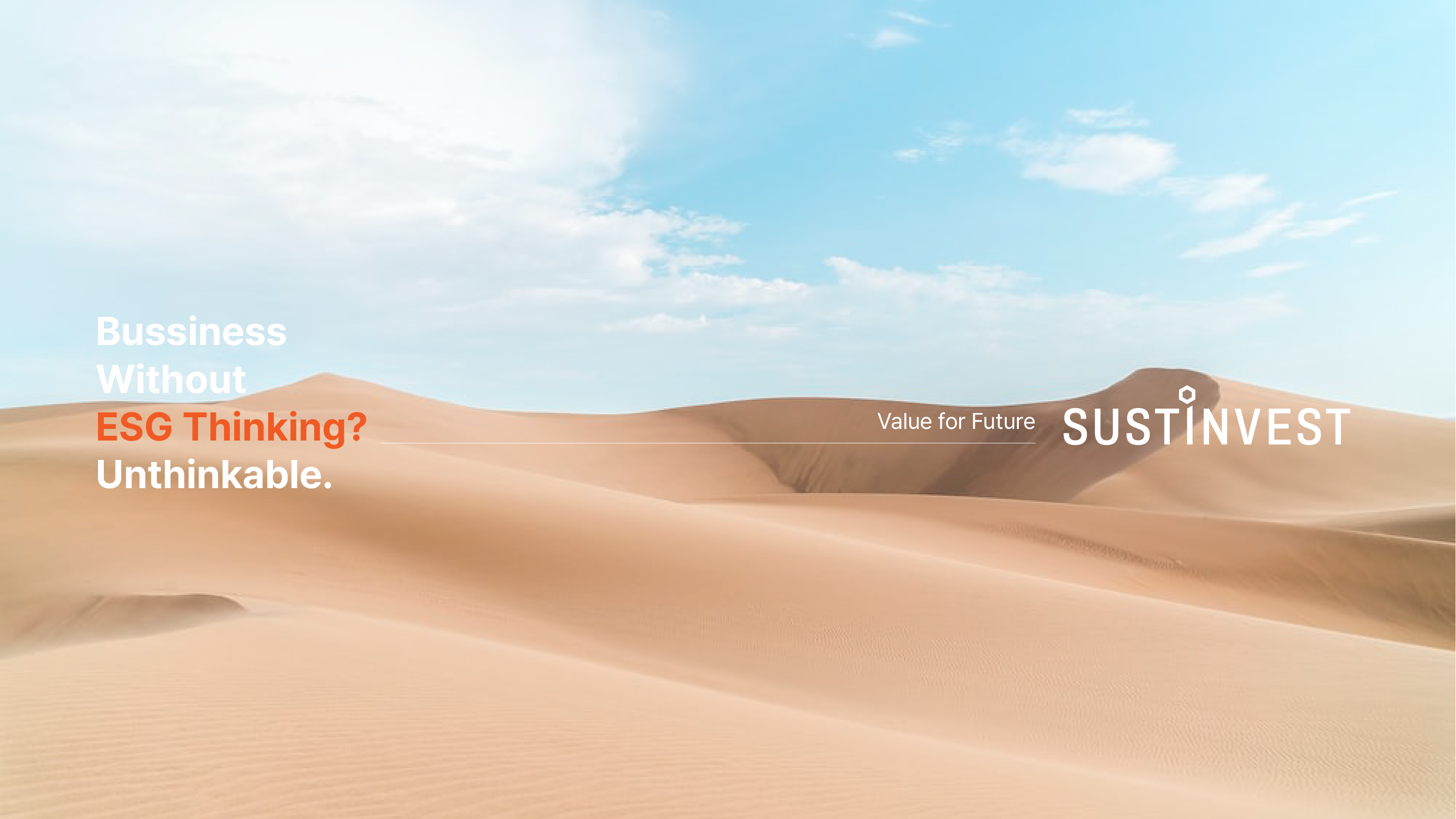
신뢰받는 ESG 평가 기관인 'SUSTINVEST'는 지속가능성(Sustainability)과 투자(Investment)의 결합으로 지속가능한 투자 생태계를 구축하고자 하는 의미를 담은 사명을 가지고 있습니다. 베리준오는 미래를 향한 비전을 담은 서스틴베스트의 아이덴티티를 새롭게 정리하였습니다.
신뢰받는 ESG 평가 기관인 'SUSTINVEST'는 지속가능성(Sustainability)과 투자(Investment)의 결합으로 지속가능한 투자 생태계를 구축하고자 하는 의미를 담은 사명을 가지고 있습니다. 베리준오는 미래를 향한 비전을 담은 서스틴베스트의 아이덴티티를 새롭게 정리하였습니다.
SUSTINVEST, a trusted ESG evaluation agency, is committed to creating a sustainable investment ecosystem by integrating sustainability principles with investment strategies. Under the direction of VERY JOON OH, the company has redefined its identity, reflecting a forward-looking vision that aligns sustainability with future investment practices.

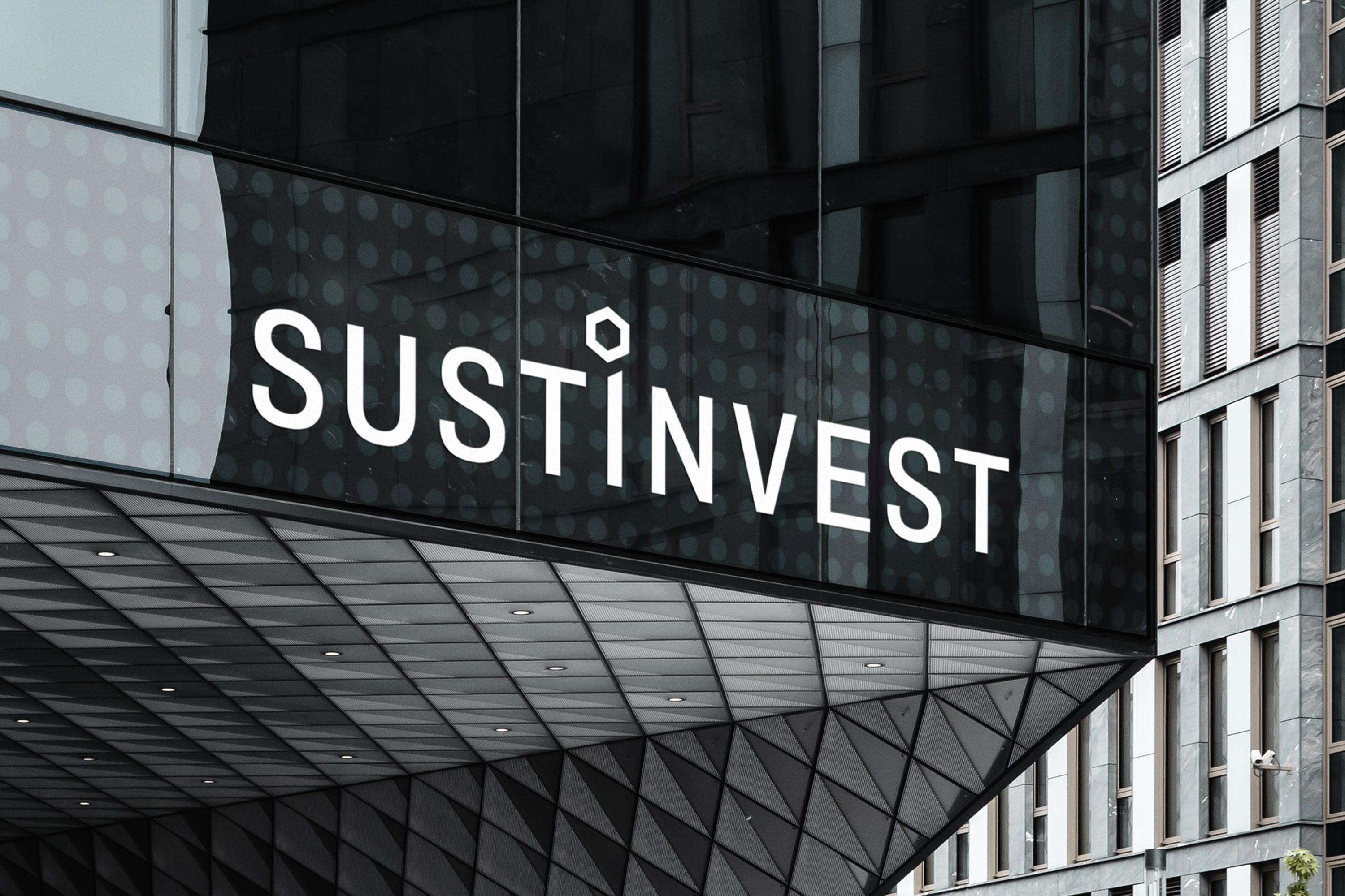
로고의 타이포그래피는 글자 간격이 일정하고 가로폭이 좁아 가독성이 높으며, 날렵하고 세련된 인상을 주어 전문성과 권위를 전달하고자 하는 의도가 담겨 있습니다. 특히 알파벳 'i'에 강조점을 두어 "지속가능한(Sustainable)"과 "투자(Investment)"의 조합인 회사명 "SUSTINVEST"를 시각적으로 표현하고자 하였습니다.
The logo's typography features an even character spacing and a narrow horizontal width, which enhances readability and conveys a sleek, sophisticated impression to communicate professionalism and authority. The emphasis on the letter 'i' is a visual representation of the company name "SUSTINVEST" which blends the concepts of "Sustainable" and "Investment."
세 개의 중첩된 육각형으로 구성된 심볼은 벌집의 형태에서 영감을 받았습니다.
이는 생태계 건강의 핵심 지표인 꿀벌을 상징하며, 동시에 기업이 추구하는 ESG (Environment, Social, Governance)의 세 가지 핵심 가치를 표현합니다. 육각형들의 유기적인 중첩은 환경, 사회, 지배구조가 서로 긴밀하게 연결되어 있음을 의미하며, 지속가능한 미래를 위해서는 이들이 균형있게 발전해야 한다는 철학을 담고 있습니다.
The symbol, composed of three overlapping hexagons, draws inspiration from the honeycomb, a representation of bees as critical indicators of ecosystem health. It symbolizes the three core pillars of ESG (Environment, Social, and Governance) embodying the company’s values. The organic overlap of the hexagons reflects the interconnected nature of these elements, emphasizing the philosophy that a balanced and integrated development of environment, society, and governance is essential for achieving a sustainable future.
Color Scheme

Document Design

베리준오는 서스티베스트가 발행하는 11개의 ESG 평가, 분석 문서의 형태와 구조를 규격화하여 통일성 있는 고객 커뮤니케이션이 가능하도록 디자인하였습니다.
VERY JOON OH has structured and designed the layout of 11 type of ESG evaluation and analysis documents published by Sustinvest, ensuring consistent and effective communication with customers.
Stationary & News Letter Design


ESG Best Company Top 100

RELATED WORKS ︎︎︎
VIEW OTHER WORKS I COMMUNICATION ︎︎︎
WE ARE HERE
Current time
베리준오 디자인센터
VJO Design Center
3F, 43, Mallijae-ro 35-gill, Jung-gu, Seoul, Korea
서울 중구 만리재로 35길 43, 3층 (04502)
+82 2 312 0280
hello@vjo.kr
베리준오 브랜드아키텍처
VJO Brand Architecture
베리준오 제주 아뜰리에
VJO Jeju Atelier
Jeju, South Korea
Design in Progress
© VJO. All rights reserved.