
2025
CRAFT JINJU BRANDING
공예진주 브랜딩
CLIENT. 진주전통공예비엔날레
︎ Branding

OVERVIEW.
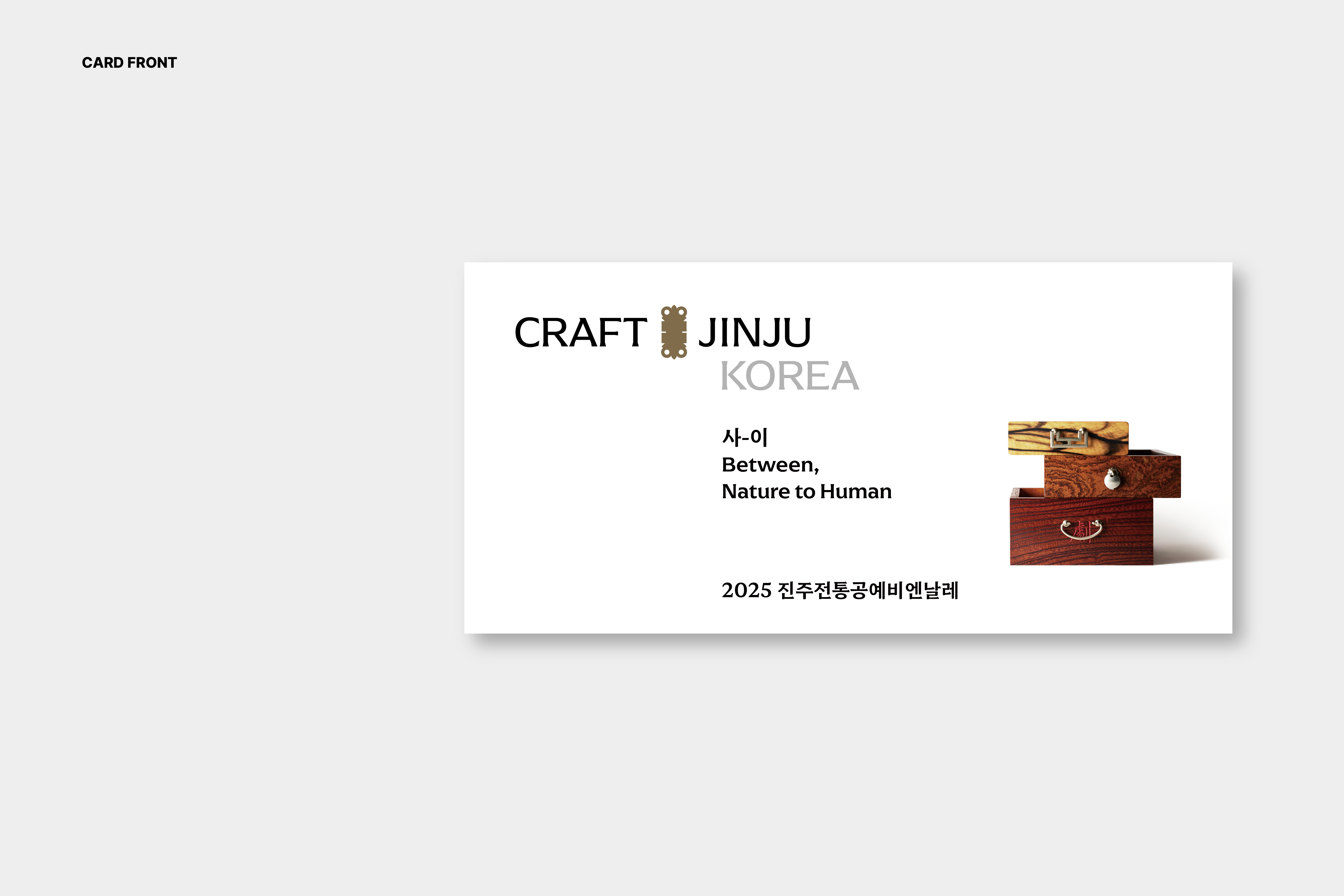
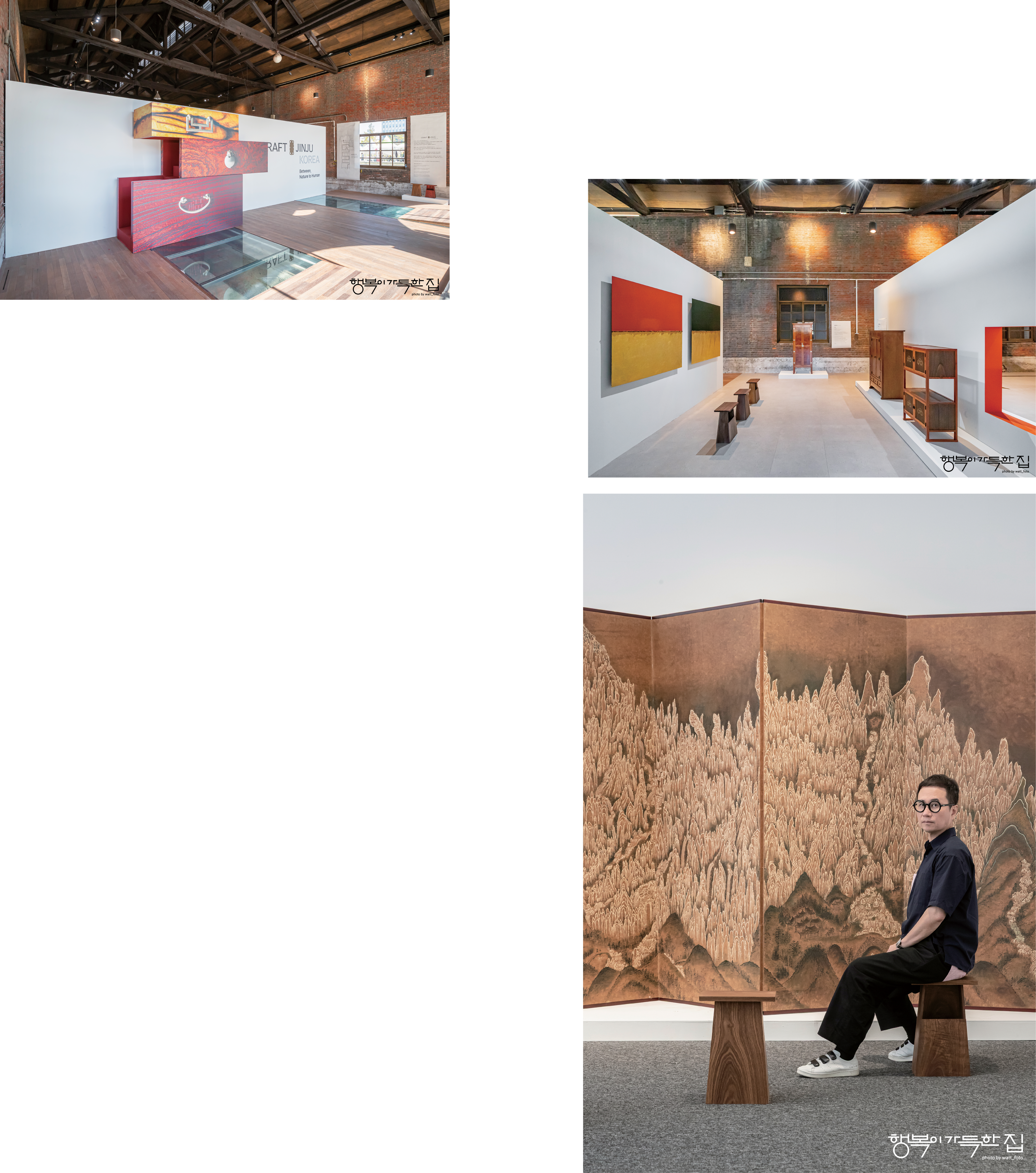
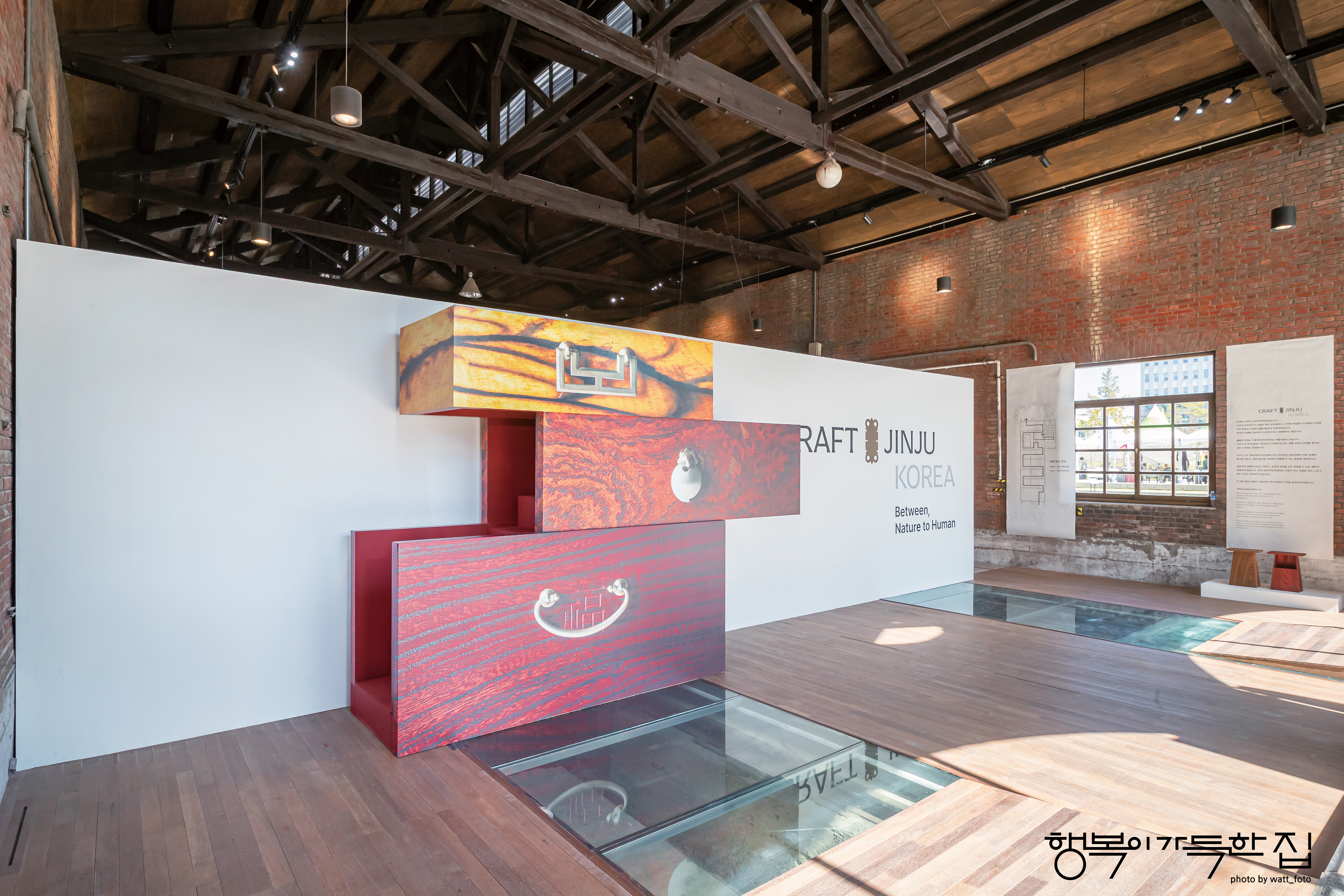
‘CRAFT JINJU’ ‘공예진주’는 2025년 개최된 진주전통공예비엔날레를 위해 베리준오디자인센터가 구축한 새로운 아이덴티티입니다.
공예 도시 진주의 문화적 유산을 현대적 시각언어로 해석하여, 비엔날레의 주제·전시·도시 공간 전반에 일관된 경험을 제공하는 것을 목표로 개발되었습니다.
‘CRAFT JINJU’ ‘공예진주’는 2025년 개최된 진주전통공예비엔날레를 위해 베리준오디자인센터가 구축한 새로운 아이덴티티입니다.
공예 도시 진주의 문화적 유산을 현대적 시각언어로 해석하여, 비엔날레의 주제·전시·도시 공간 전반에 일관된 경험을 제공하는 것을 목표로 개발되었습니다.
CRAFT JINJU is a new identity developed by Very Joon Oh Design Center for the 2025 Jinju Traditional Craft Biennale. It reinterprets the cultural heritage of Jinju—a city of craft—through a contemporary visual language, aiming to deliver a cohesive experience across the biennale’s theme, exhibitions, and urban spaces.
NAMING.
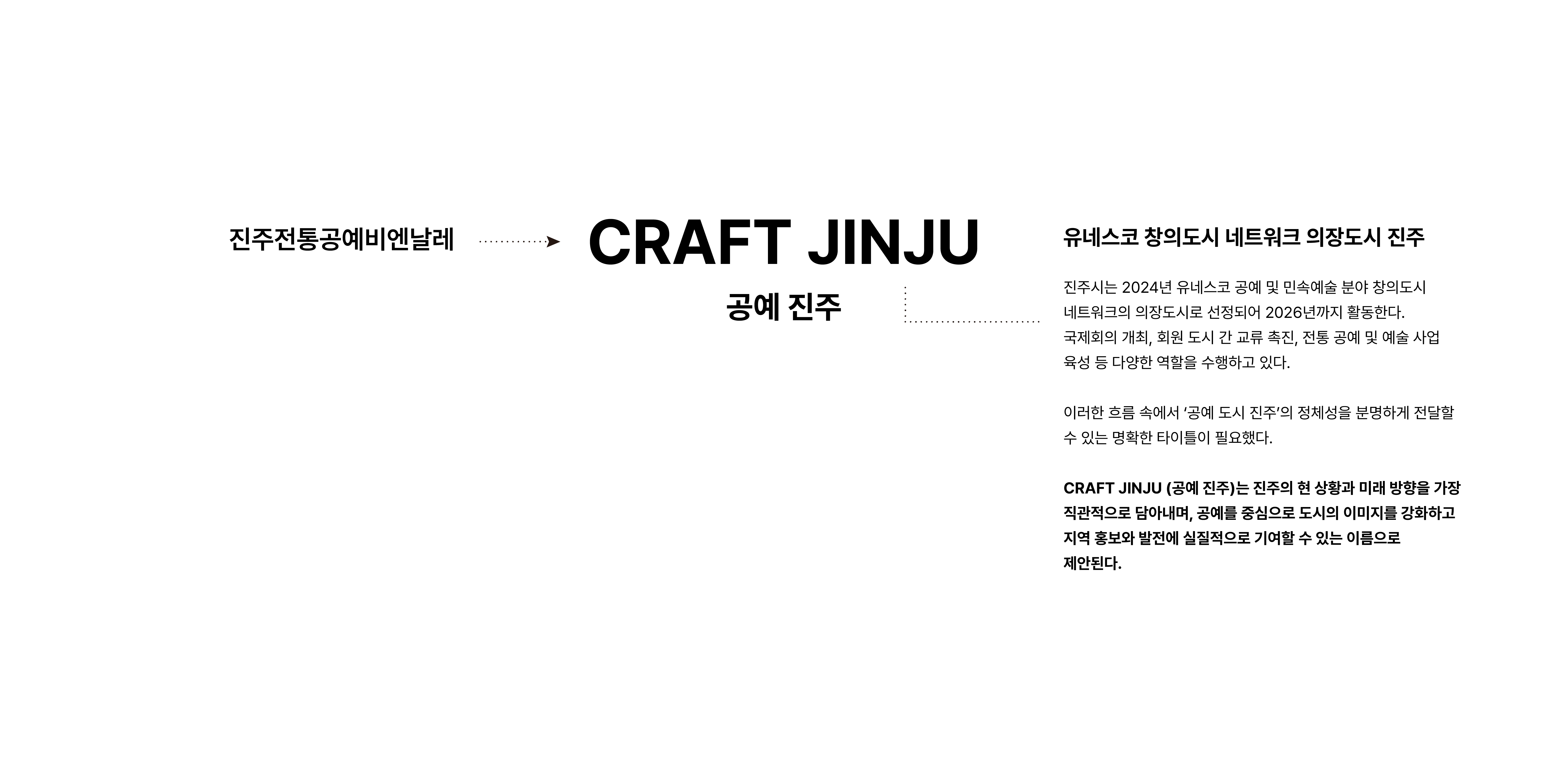
기존 비엔날레의 명칭은 ‘진주전통공예비엔날레’였습니다.
그러나 이 명칭은 다소 길고, 국내외 관람객에게 유네스코 공예 및 민속예술 분야의 의장도시 진주에 대한 전달하기 어렵다는 한계가 있었습니다.
이에 따라 베리준오디자인센터는 공예 도시로서의 진주의 정체성을 강화하고, 국제적 인지 확장에 적합한 브랜드 네임을 구축하는 방향으로 네이밍을 재정립했습니다.
기존 비엔날레의 명칭은 ‘진주전통공예비엔날레’였습니다.
그러나 이 명칭은 다소 길고, 국내외 관람객에게 유네스코 공예 및 민속예술 분야의 의장도시 진주에 대한 전달하기 어렵다는 한계가 있었습니다.
이에 따라 베리준오디자인센터는 공예 도시로서의 진주의 정체성을 강화하고, 국제적 인지 확장에 적합한 브랜드 네임을 구축하는 방향으로 네이밍을 재정립했습니다.
The previous name of the biennale was “Jinju Traditional Craft Biennale.”
However, the title was relatively long and made it difficult for both domestic and international audiences to clearly recognize Jinju’s status as a UNESCO Creative City of Crafts and Folk Art.
To address this, Very Joon Oh Design Center redefined the naming strategy, strengthening Jinju’s identity as a craft city and establishing a brand name better suited for international recognition and expansion.
SYMBOL DEVELOPE.
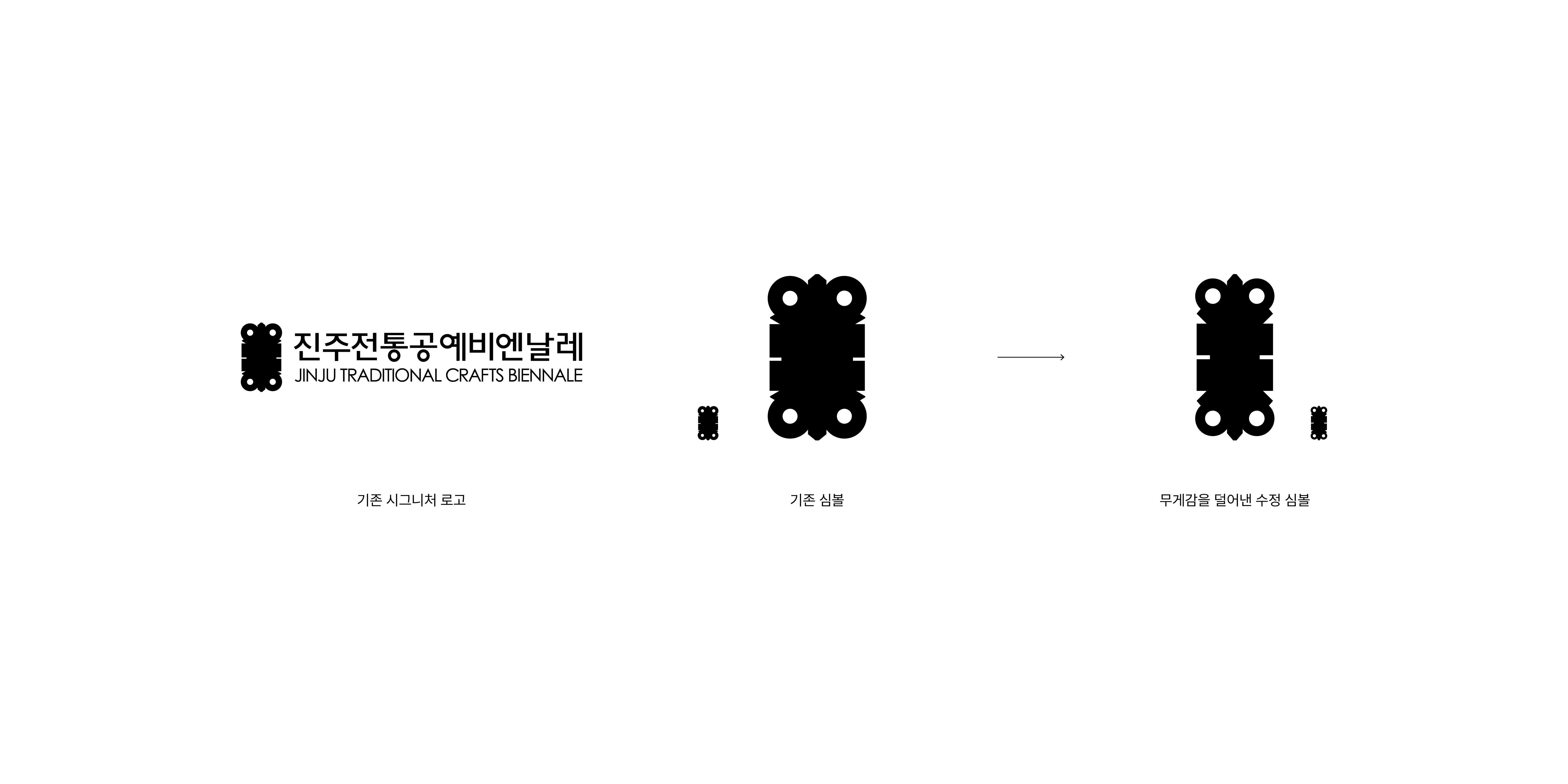
진주전통공예비엔날레의 심볼은 한국 공예에서 오랫동안 사용되어 온 장석(매미장석)의 형태를 모티프로 개발되었습니다.
기존 심볼은 디테일에 비해 부족한 여백으로 뭉쳐보이는 인상이 강했습니다. 이에 따라 CRAFT JINJU의 아이덴티티에서는 심볼의 비례와 무게감을 조정하여 보다 세련된 인상을 부여했습니다.
이를 통해 진주의 공예 정신을 집약적으로 표현함과 동시에, 한국 공예의 국제적 확장을 위한 정돈된 시각적 기준을 제시합니다.
진주전통공예비엔날레의 심볼은 한국 공예에서 오랫동안 사용되어 온 장석(매미장석)의 형태를 모티프로 개발되었습니다.
기존 심볼은 디테일에 비해 부족한 여백으로 뭉쳐보이는 인상이 강했습니다. 이에 따라 CRAFT JINJU의 아이덴티티에서는 심볼의 비례와 무게감을 조정하여 보다 세련된 인상을 부여했습니다.
이를 통해 진주의 공예 정신을 집약적으로 표현함과 동시에, 한국 공예의 국제적 확장을 위한 정돈된 시각적 기준을 제시합니다.
The symbol of the former Jinju Traditional Craft Biennale was inspired by the shape of jangseok—a traditional metal ornament used in Korean craft for centuries.
However, the previous symbol appeared visually dense, as its intricate details were not supported by sufficient negative space.
In the identity for CRAFT JINJU, the proportions and visual weight of the symbol were refined to create a more sophisticated and balanced impression.
This adjustment not only distills the spirit of Jinju’s craft culture into a clear visual form but also establishes a polished standard suitable for the international expansion of Korean craft.
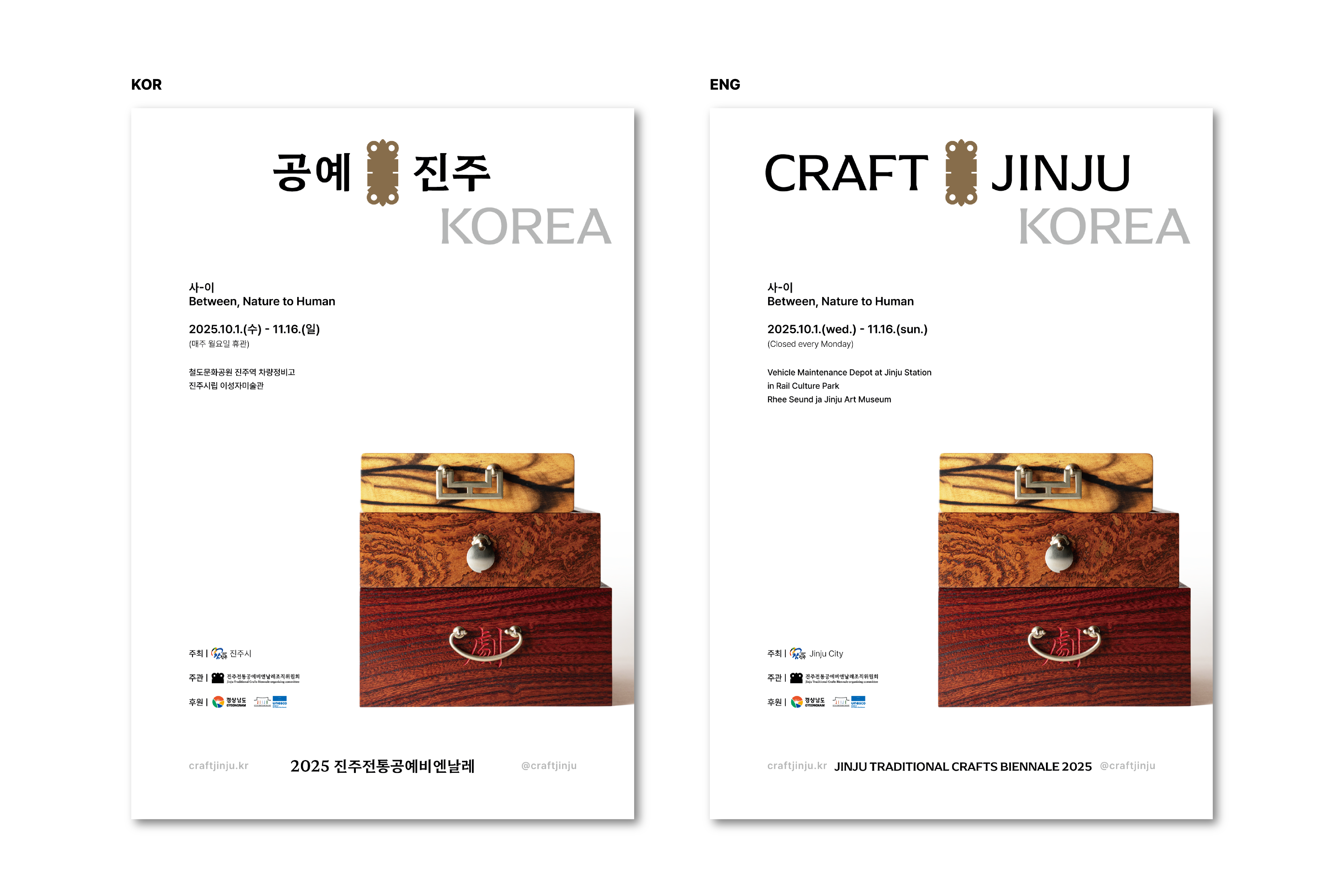
SIGNATURE LOGO DEVELOPE.
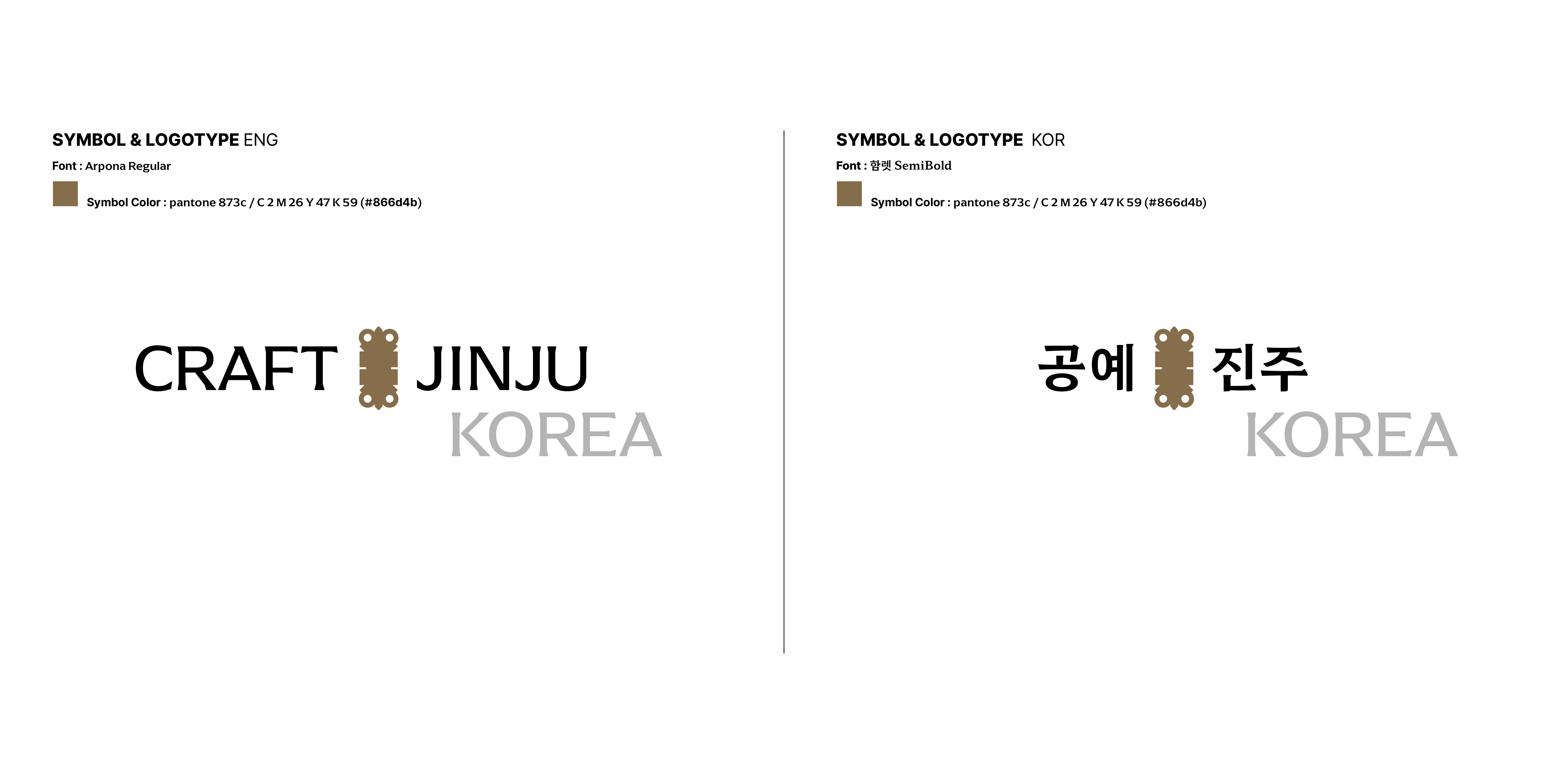
CRAFT와 JINJU 사이에 배치된 매미장석 모티프는 전통 가구에서 사용된 금속 장식을 참조한 요소로,
‘전통의 연결’을 상징하는 핵심 오브젝트입니다.
이 장석 형태는 진주가 지닌 공예적 유산을 현대적으로 해석한 것으로 두 단어 사이의 결속을 시각적으로 강화하며 브랜드의 정체성을 명확하게 규정합니다.
또한 하단의 KOREA 표기는 진주 공예비엔날레가 국가·도시 차원의 문화 브랜드임을 직관적으로 드러내기 위해 추가된 요소로 국제적 맥락에서 ‘한국 전통 공예 도시 진주’의 위상을 보다 명확히 인식할 수 있도록 기능합니다.
전체 시그니처는 전통성과 현대성을 균형 있게 담아내도록 구성되었으며,
국내외 다양한 매체에서 일관된 브랜드 이미지로 확장될 수 있도록 설계되었습니다.
The cicada-shaped jangseok motif placed between CRAFT and JINJU references the metal ornaments traditionally used in Korean furniture and serves as a key symbol of “connecting tradition.”
This form reinterprets Jinju’s craft heritage in a contemporary manner, visually reinforcing the bond between the two words and clearly defining the brand identity.
The KOREA descriptor positioned at the bottom further emphasizes that the Jinju Craft Biennale represents a cultural brand at both the national and city levels.
In an international context, it helps audiences immediately recognize Jinju as Korea’s representative city of traditional craft.
The overall signature is designed to balance tradition and modernity, enabling the identity to expand consistently across a wide range of domestic and global applications.
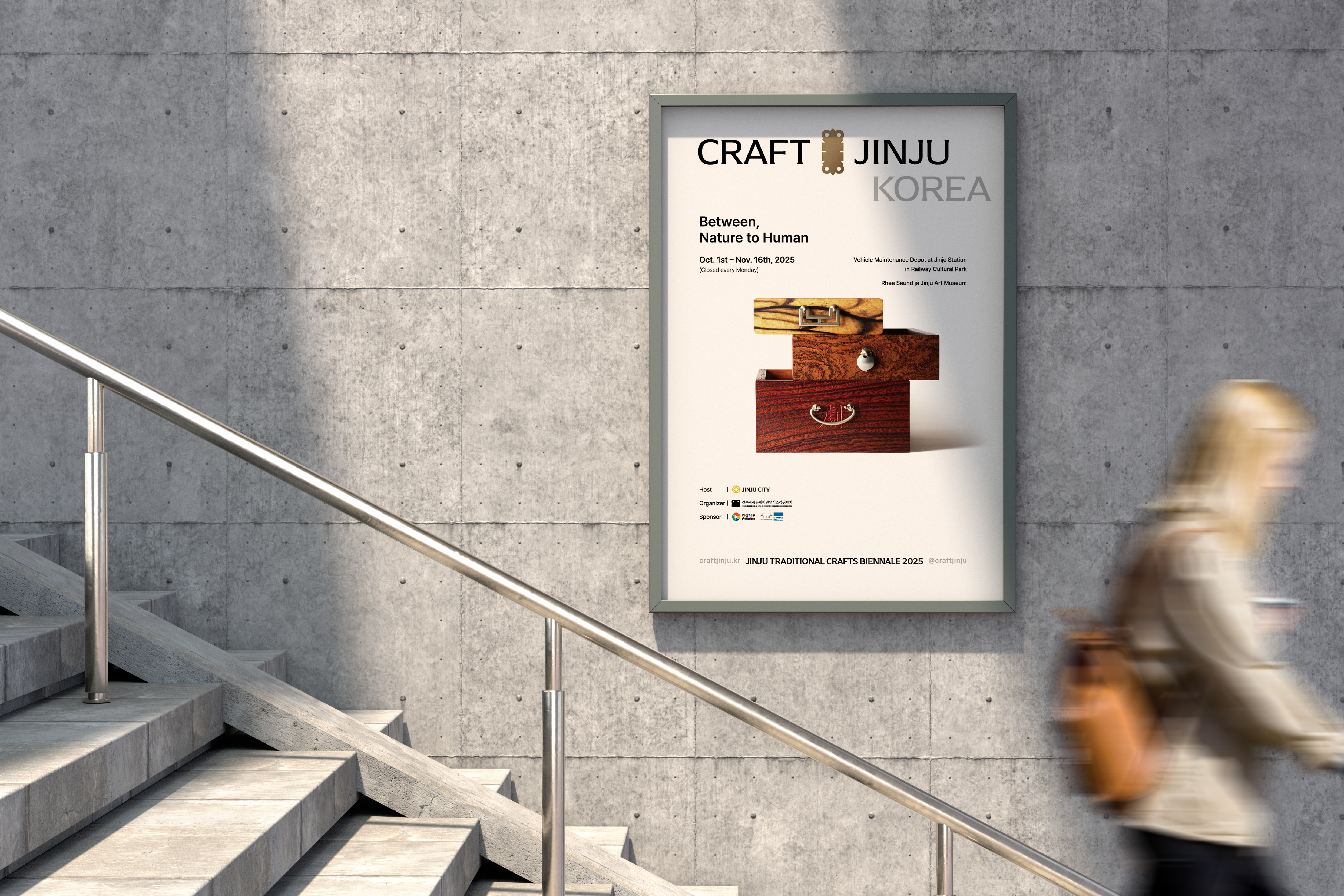
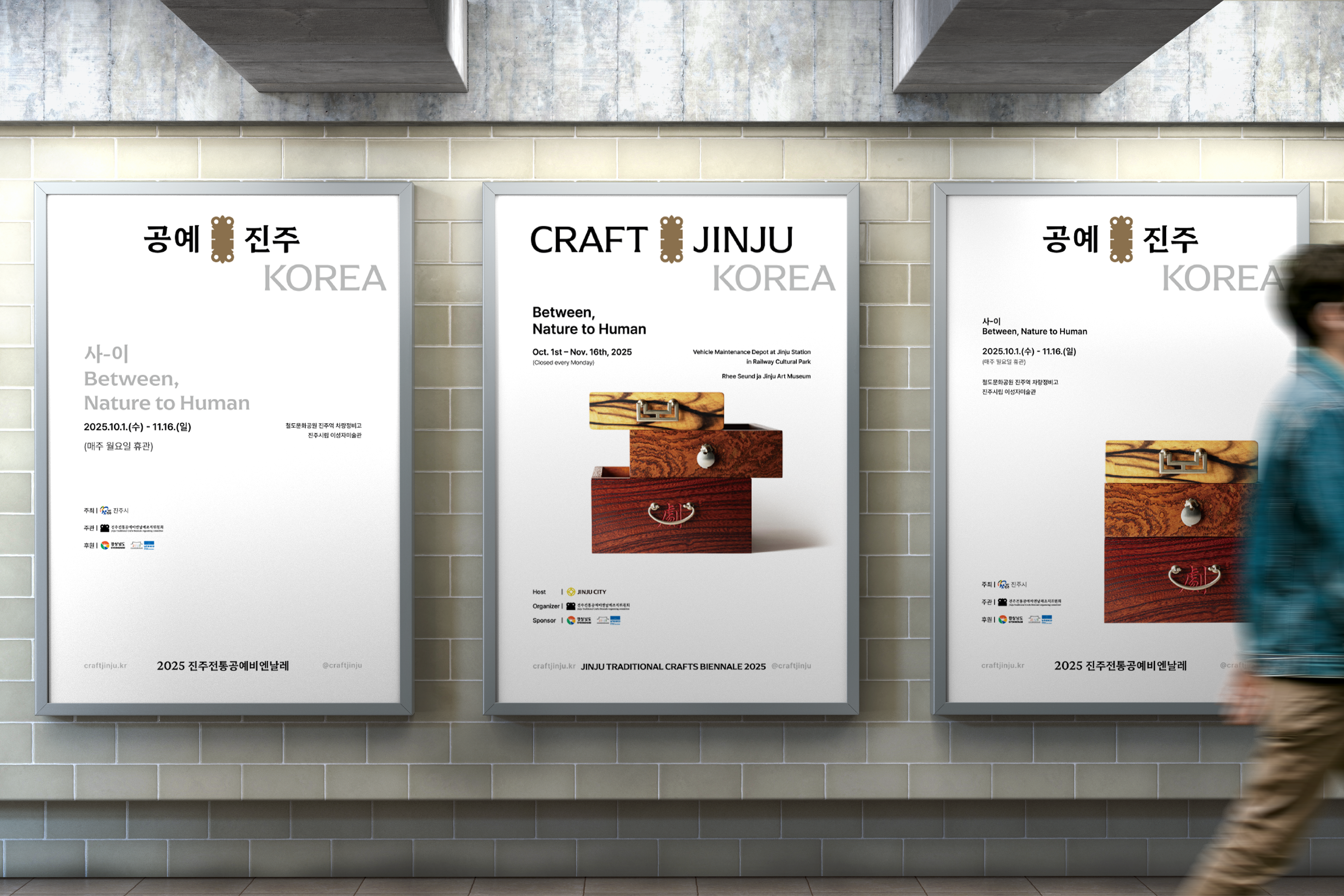
POSTER


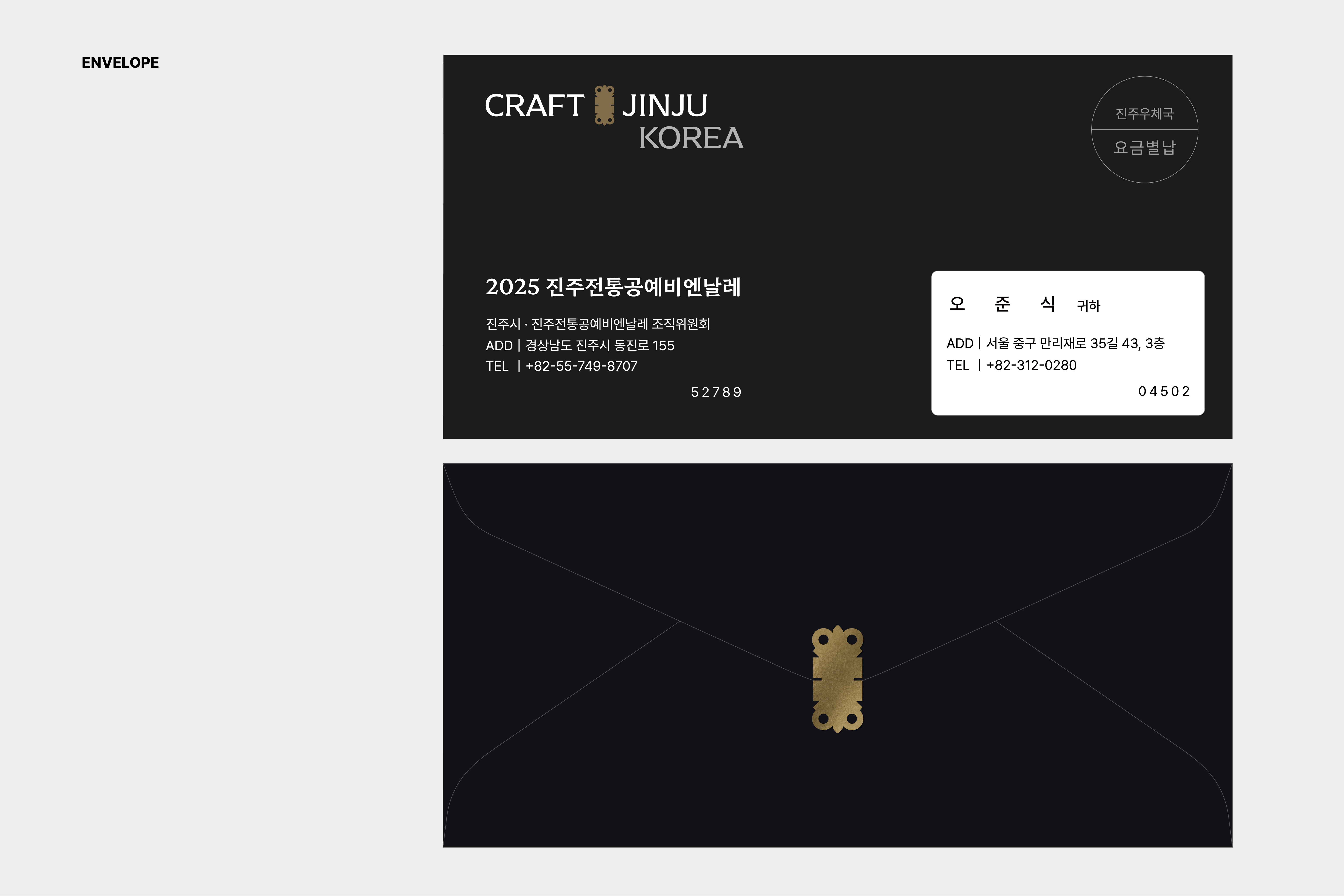
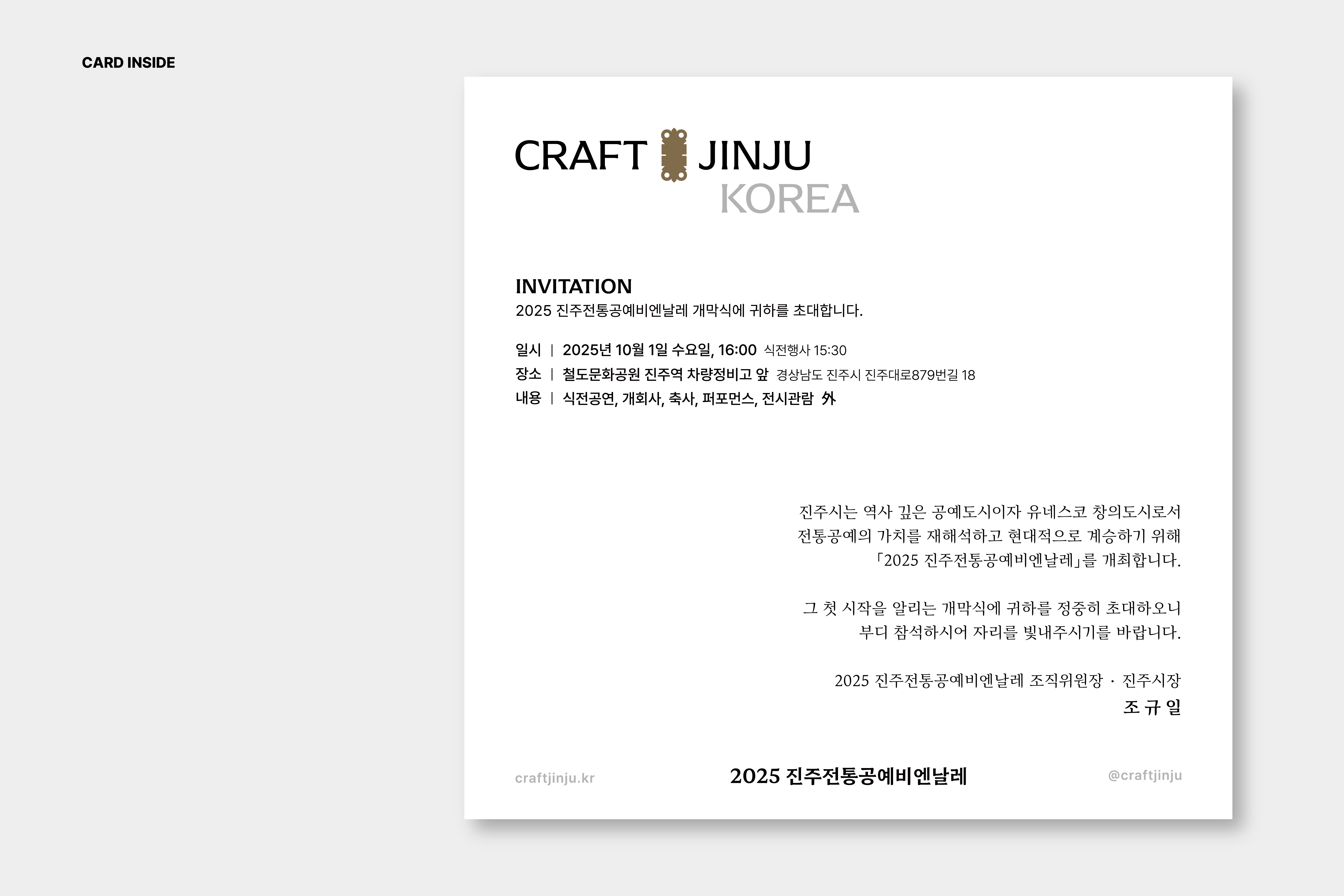
INVITATION
RELATED WORKS ︎︎︎
VIEW OTHER WORKS I COMMUNICATION ︎︎︎
WE ARE HERE
Current time
베리준오 디자인센터
VJO Design Center
3F, 43, Mallijae-ro 35-gill, Jung-gu, Seoul, Korea
서울 중구 만리재로 35길 43, 3층 (04502)
+82 2 312 0280
hello@vjo.kr
베리준오 브랜드아키텍처
VJO Brand Architecture
베리준오 제주 아뜰리에
VJO Jeju Atelier
Jeju, South Korea
Design in Progress
© VJO. All rights reserved.