
2025
HONG LEEM IDENTITY
홍림회 아이덴티티
CLIENT. HONG LEEM
︎ Branding
OVERVIEW.
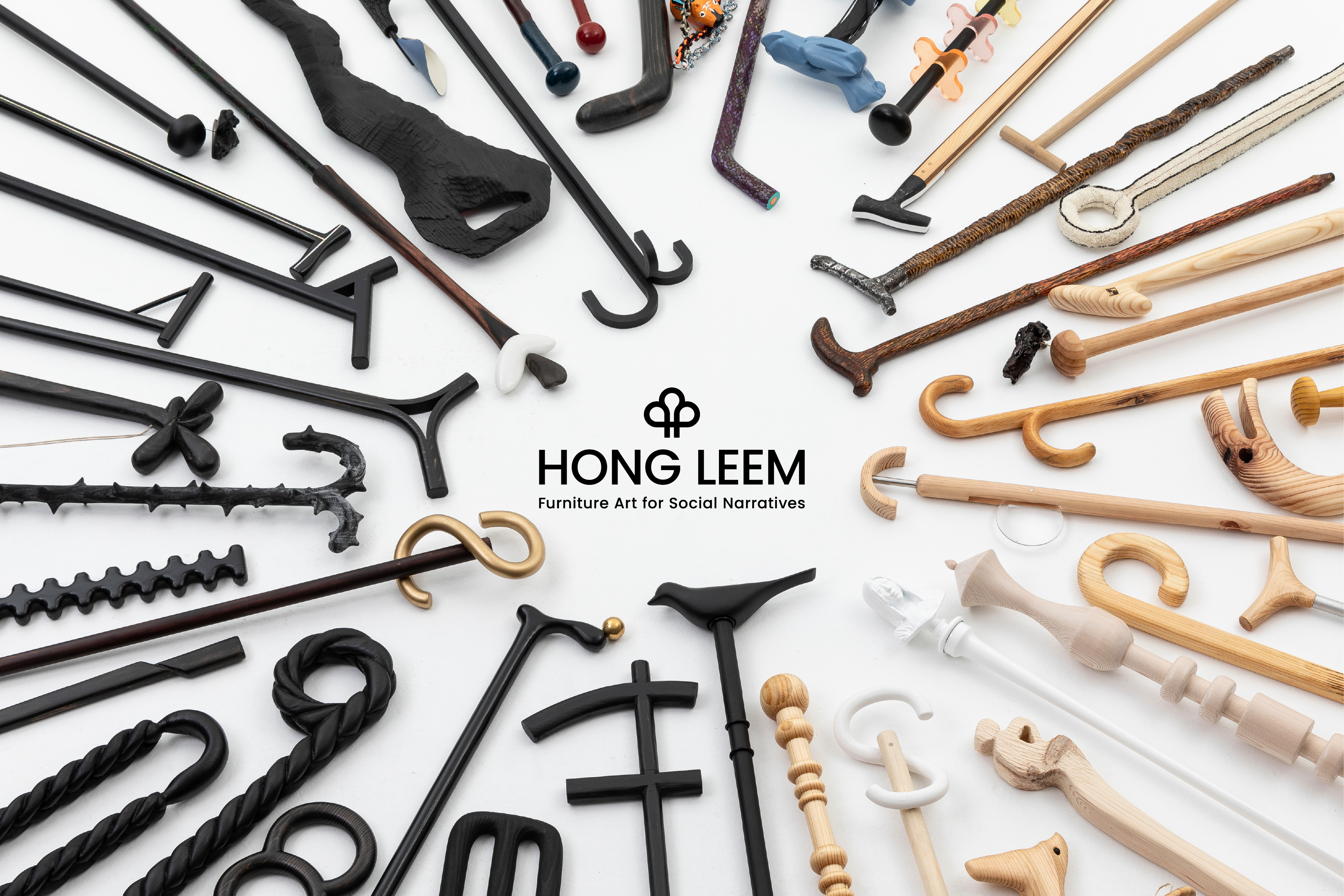
홍림회는 홍익대학교 미술대학 목조형가구학과 동문들로 이루어진 전시단체로, 우리나라 목공예와 가구 디자인계를 선도하는 작가와 디자이너들의 특색 있고 수준 높은 작품들을 대중에게 소개하고 있습니다.
홍림회는 Art모임으로 시작하여 1982년 한국디자인포장센터 창립전을 시작으로 19회 까지는 자유작품 출품을 추구하였으나, 지난 2001년 20주년 기념전으로 기획된 [젓가락] 전을 계기로 홍림회는 공예와 디자인 문화의 새로운 발전을 모색해 왔습니다.
이후 [구둣주걱], [걸이], [Key container], [테이블], [담다], [빛] 등의 삶의 핵심을 담은 다채로운 주제로 전시를 기획하여, 이를 통해 많은 호평과 관심을 받았습니다.
2022년 산불사고를 기점으로 산불 피해와 회복을 전시 주제로 다루며 사회적 주제를 예술에 반영한 창작을 이어오고 있습니다.
HONG LEEM is an exhibition collective composed of alumni from the WOODWORKING and FURNITURE DESIGN department of Hongik University College of Fine Arts. The group introduces distinctive and high-quality works by leading artists and designers who have played a significant role in shaping Korea’s woodworking, craft, and furniture design scene, bringing their work closer to the public.
HONG LEEM began as an art-oriented gathering and held its inaugural exhibition in 1982 at the Korea Design & Packaging Center. Until its 19th exhibition, the group pursued an open format centered on freely presented works. A turning point came with its 20th anniversary exhibition in 2001, [Chopsticks], which marked the beginning of a more concept-driven approach and a renewed exploration of the future of craft and design culture.
Since then, HONG LEEM has curated exhibitions around diverse themes rooted in everyday life—such as [Shoehorn], [Hanger], [Key Container], [Table], [Contain], and [Light]—earning wide recognition and critical acclaim for its thoughtful perspectives and refined craftsmanship.
Following the 2022 wildfire disaster, the collective has continued its creative practice by addressing issues of wildfire damage and recovery as exhibition themes, expanding its work to reflect social concerns through art and design.
LOGO DEVELOPMENT.
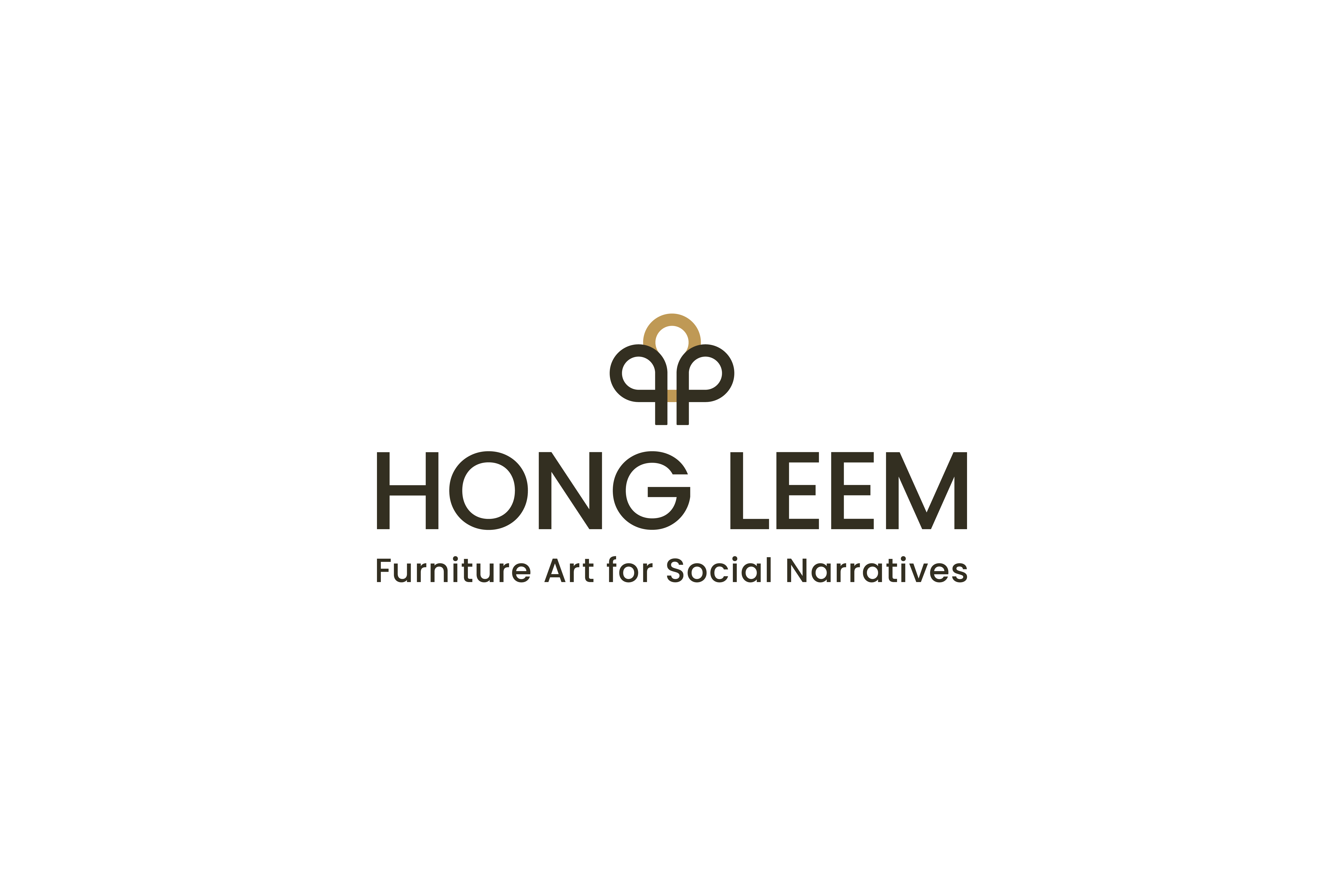
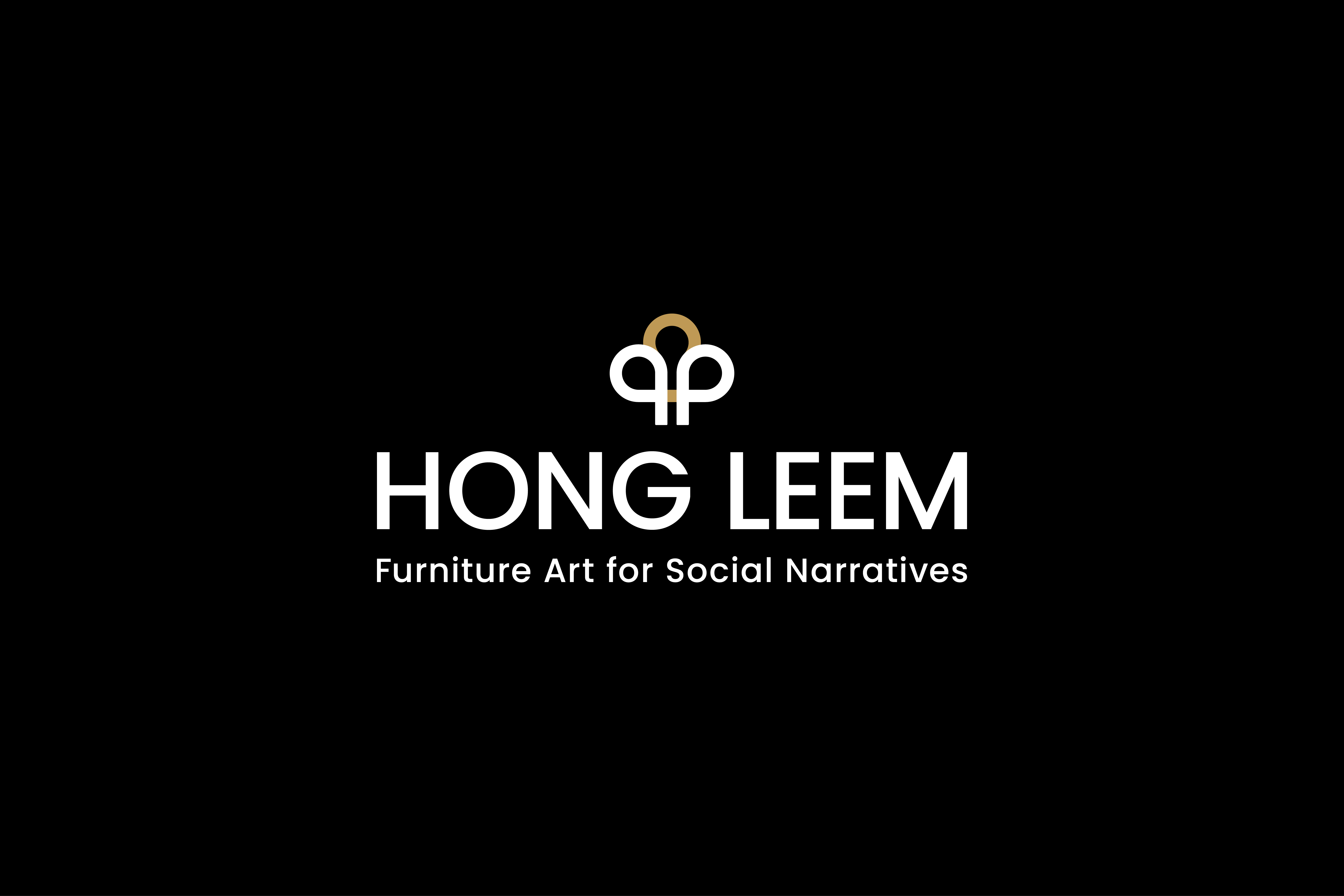
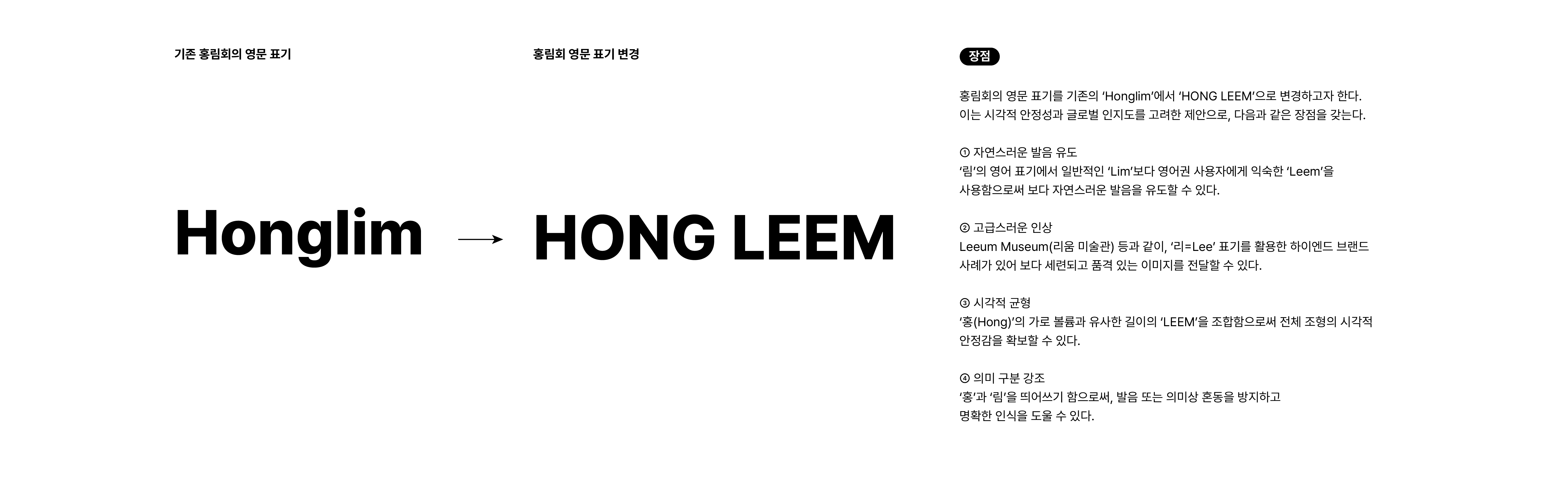
홍림회는 기존의 영문 표기인 Honglim에서 HONG LEEM으로 영문 철자를 정비하고, 이에 맞추어 심볼의 형태를 함께 다듬으며 브랜드 아이덴티티를 재정비하였습니다.
영문 표기 변경은 발음의 명확성과 국제적 인지도를 고려한 결정으로, ‘Hong’과 ‘Leem’을 분리하여 표기함으로써 의미 전달의 혼선을 줄이고 보다 안정적인 시각적 인상을 구축하고자 하였습니다.
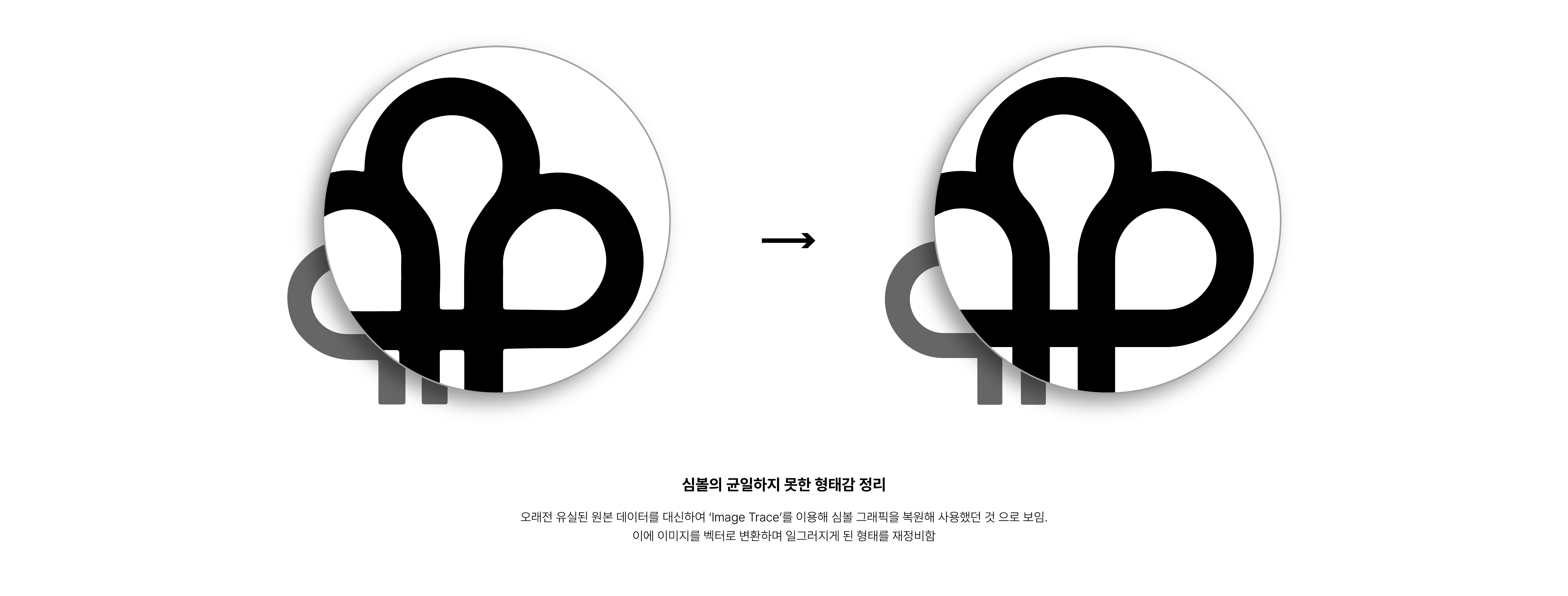
또한 기존 심볼은 오랜 사용 과정에서 발생한 훼손된 형태를 개선하기 위하여, 선의 흐름을 정제하여 재정비 하였습니다.
이번 아이덴티티 정비는 새로운 이미지를 도입하기보다, 홍림회가 축적해 온 역사와 정체성을 존중하며 현재의 환경에 맞게 정돈하는 데에 중점을 두고 있습니다. 이를 통해 향후 전시 및 다양한 매체 환경에서도 일관되고 확장 가능한 시각 체계를 구축하고자 합니다.
홍림회는 기존의 영문 표기인 Honglim에서 HONG LEEM으로 영문 철자를 정비하고, 이에 맞추어 심볼의 형태를 함께 다듬으며 브랜드 아이덴티티를 재정비하였습니다.
영문 표기 변경은 발음의 명확성과 국제적 인지도를 고려한 결정으로, ‘Hong’과 ‘Leem’을 분리하여 표기함으로써 의미 전달의 혼선을 줄이고 보다 안정적인 시각적 인상을 구축하고자 하였습니다.
또한 기존 심볼은 오랜 사용 과정에서 발생한 훼손된 형태를 개선하기 위하여, 선의 흐름을 정제하여 재정비 하였습니다.
이번 아이덴티티 정비는 새로운 이미지를 도입하기보다, 홍림회가 축적해 온 역사와 정체성을 존중하며 현재의 환경에 맞게 정돈하는 데에 중점을 두고 있습니다. 이를 통해 향후 전시 및 다양한 매체 환경에서도 일관되고 확장 가능한 시각 체계를 구축하고자 합니다.
HONG LEEM has refined its English name from Honglim to HONG LEEM, and, in parallel, has carefully refined the form of its symbol to reorganize and strengthen its brand identity.
The change in English spelling was made in consideration of clearer pronunciation and greater international recognition. By separating “Hong” and “Leem,” the name avoids potential ambiguity in meaning and pronunciation, while establishing a more stable and balanced visual impression. In addition, the existing symbol was refined to address distortions that had occurred over prolonged use, with the flow of lines carefully adjusted to restore clarity and formal coherence.
Rather than introducing an entirely new image, this identity renewal focuses on respectfully refining the history and character that HONG LEEM has accumulated over time, aligning it with contemporary contexts. Through this process, the collective aims to establish a consistent and extensible visual system that can be applied across future exhibitions and a wide range of media platforms.
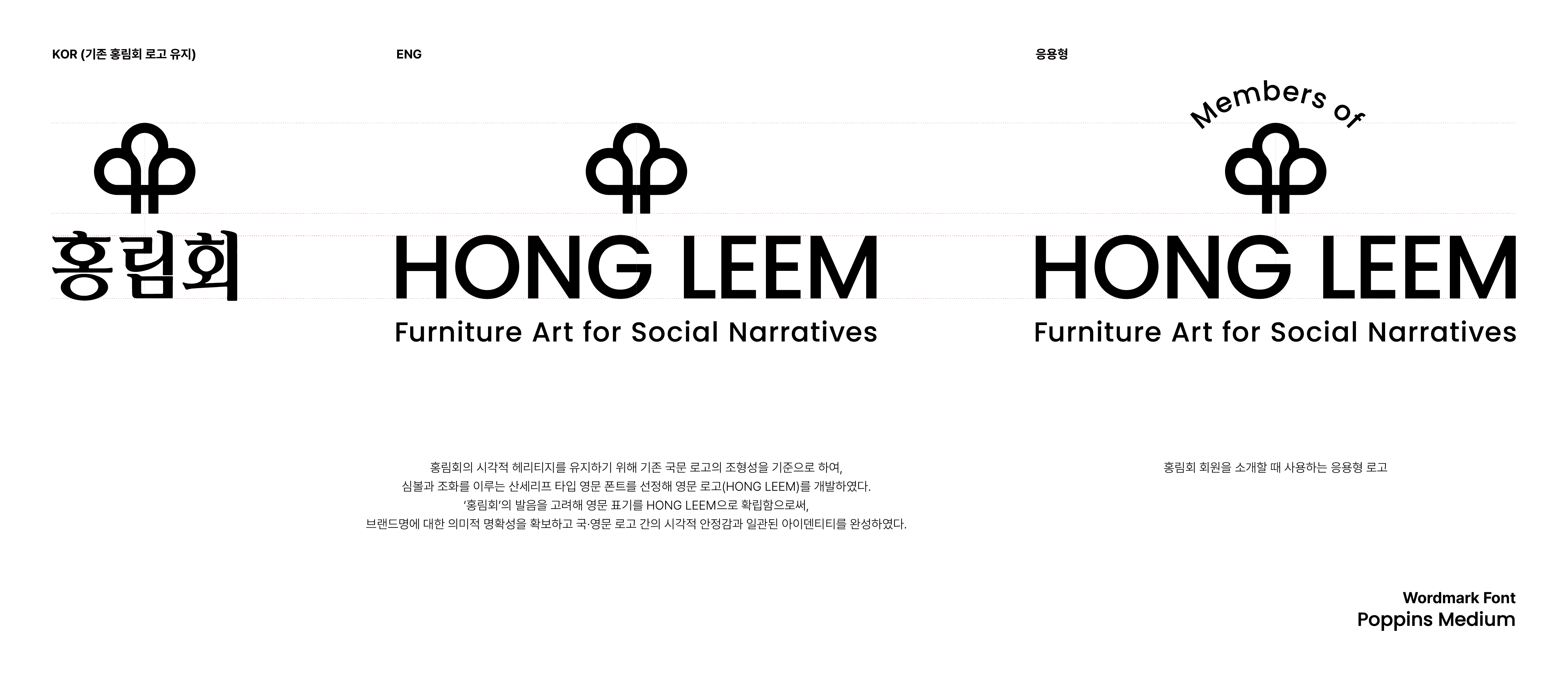
홍림회의 로고는 국문, 영문, 그리고 활용 목적에 따라 확장 가능한 응용형으로 구성되어 있습니다.
국문 로고는 기존 홍림회의 시각적 헤리티지를 유지하기 위해 기존 로고 타입을 유지하여 사용하며, 영문 로고는 새롭게 정비된 영문 표기 HONG LEEM을 기준으로 개발되었습니다.
영문 로고는 심볼과 조화를 이루는 산세리프 타입을 적용하여 현대적이면서도 안정적인 인상을 전달하며, 국문 로고와 병기하거나 단독으로 사용하였을 때에도 일관된 브랜드 이미지를 유지할 수 있도록 설계되었습니다.
응용형 로고는 ‘Members of HONG LEEM’과 같이 특정 맥락에서의 사용을 고려하여 구성되었으며, 전시, 출판물, 소개 자료 등 다양한 매체 환경에서 유연하게 활용할 수 있도록 확장성을 확보하였습니다.
The HONG LEEM logo system consists of Korean, English, and application-specific versions designed to be flexibly extended according to context and usage.
The Korean logotype retains the existing typographic form in order to preserve HONG LEEM’s visual heritage, while the English logotype has been newly developed based on the refined English name, HONG LEEM.
The English logotype employs a sans-serif typeface that harmonizes with the symbol, conveying a modern yet stable visual impression. It has been carefully designed to maintain a consistent brand identity whether used independently or in combination with the Korean logotype.
Application-specific versions, such as “Members of HONG LEEM,” have been developed for contextual use, ensuring flexibility and adaptability across a wide range of media, including exhibitions, publications, and informational materials.
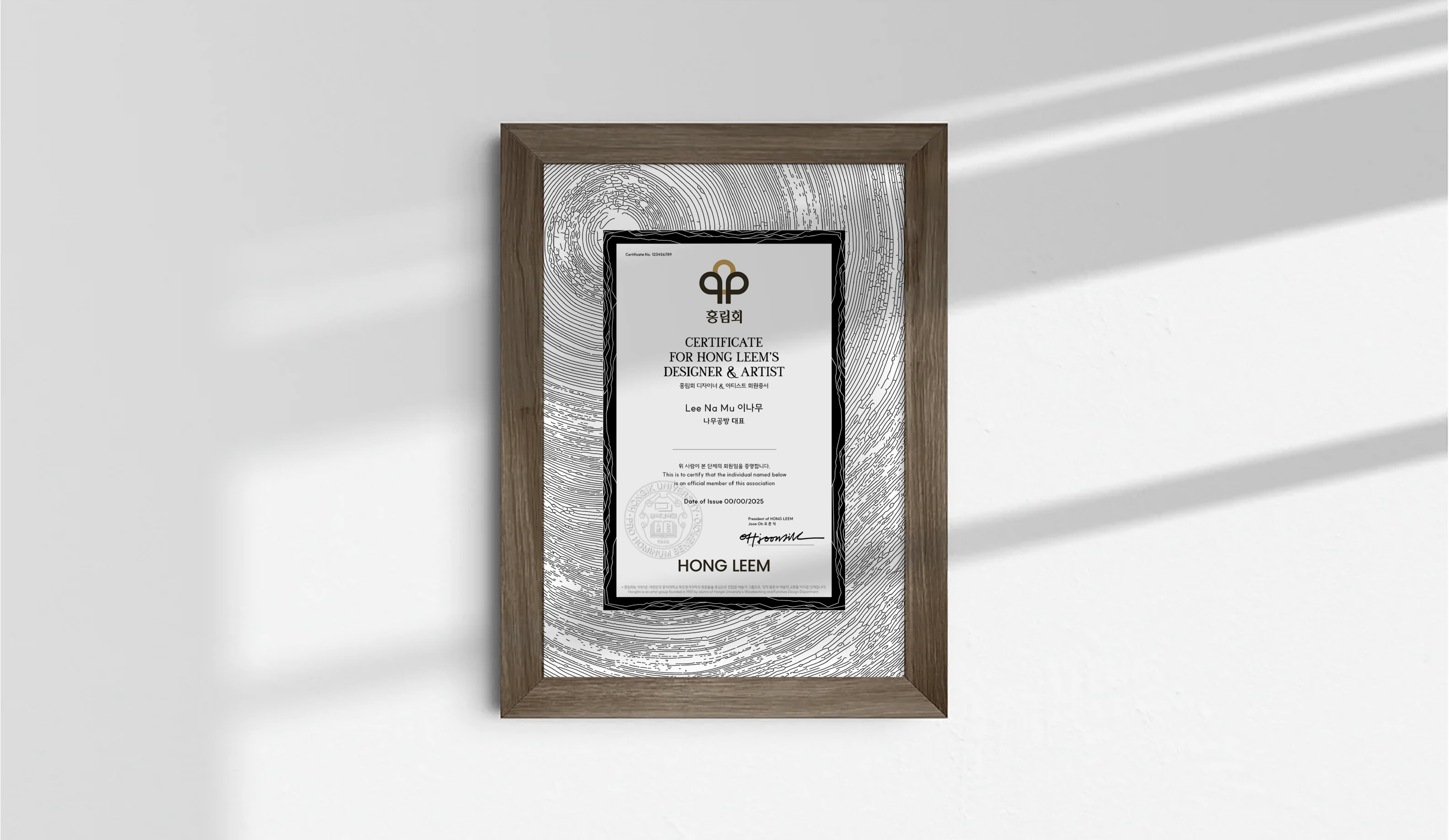
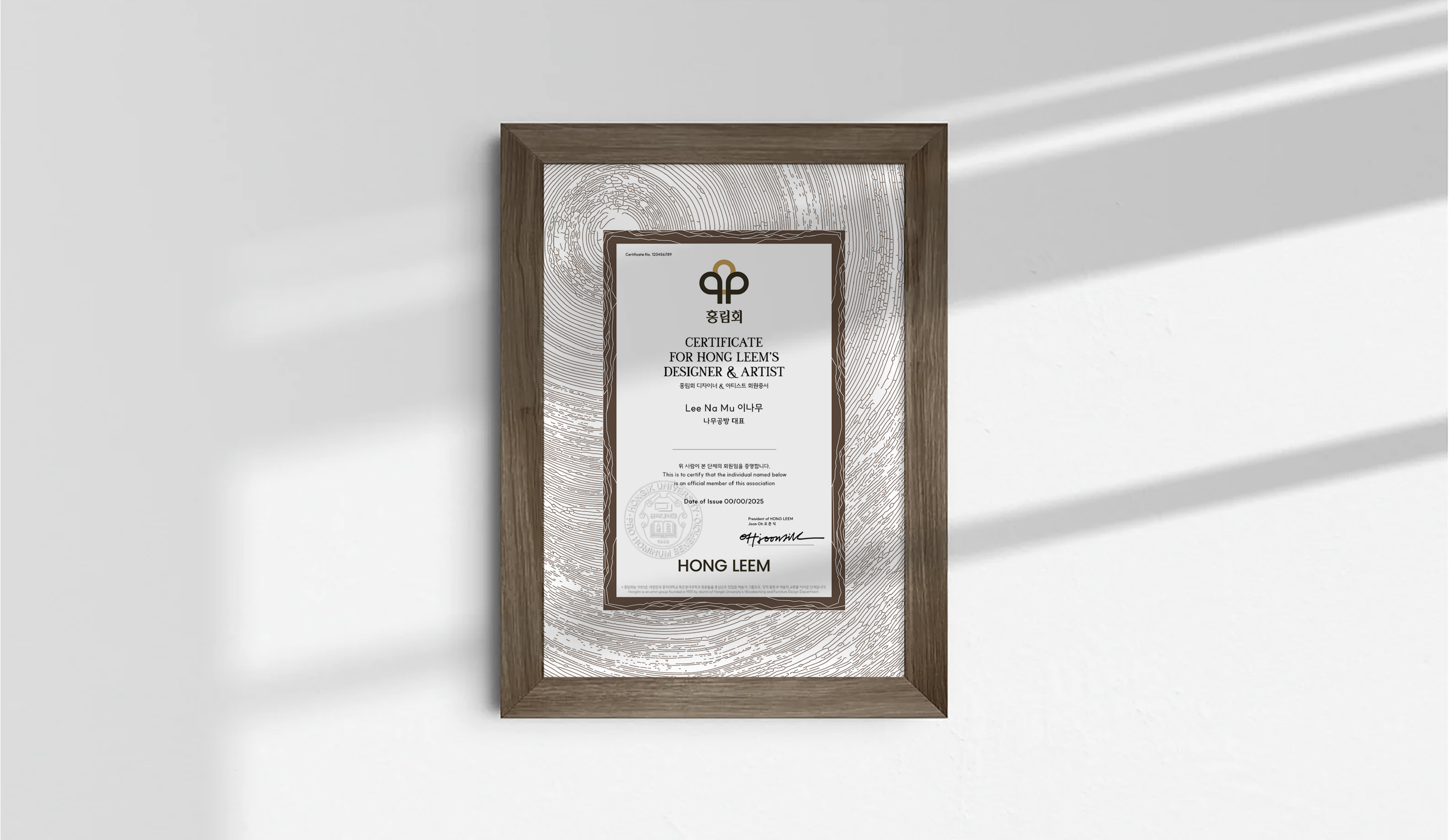
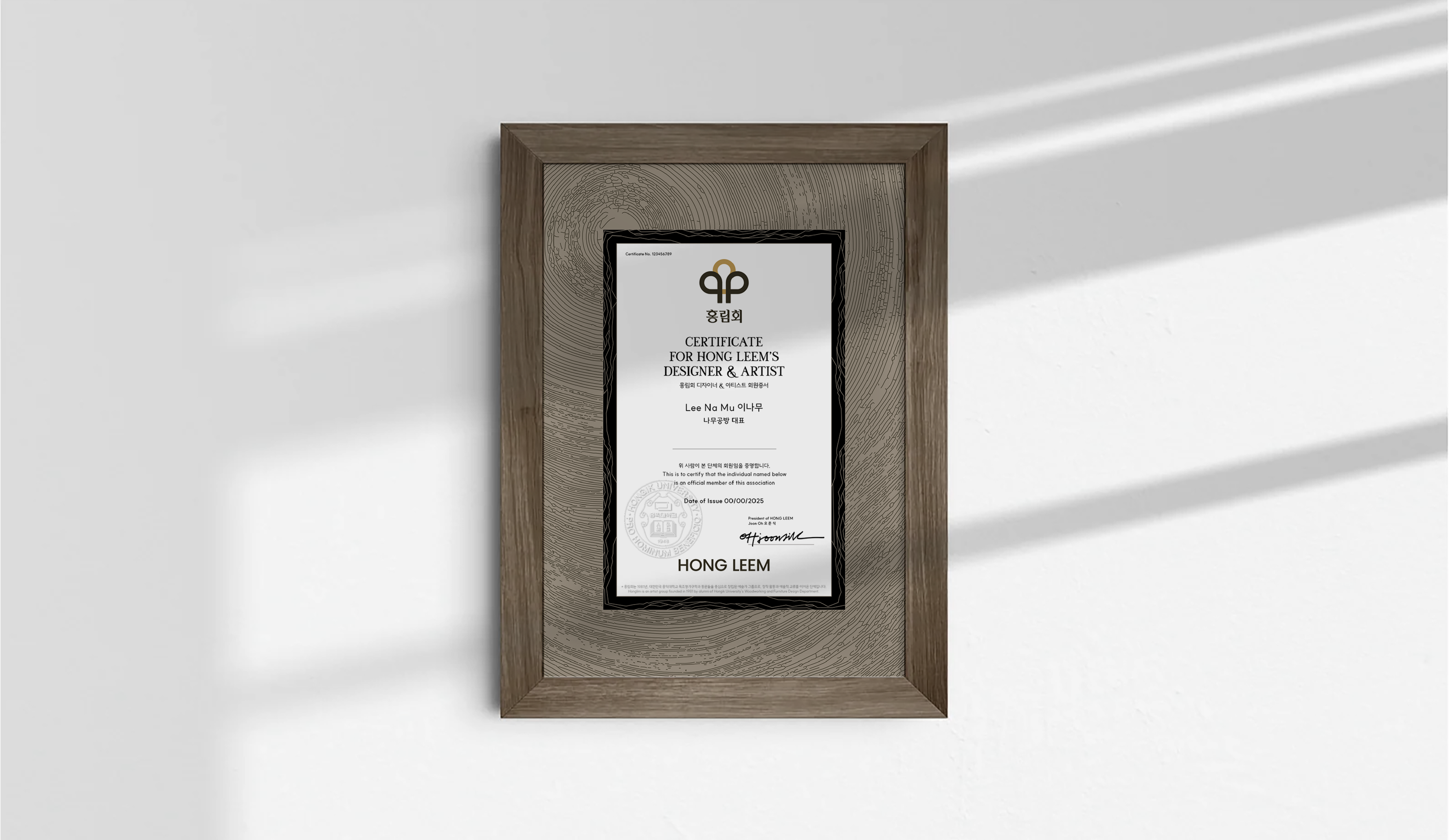
CERTIFICATION.
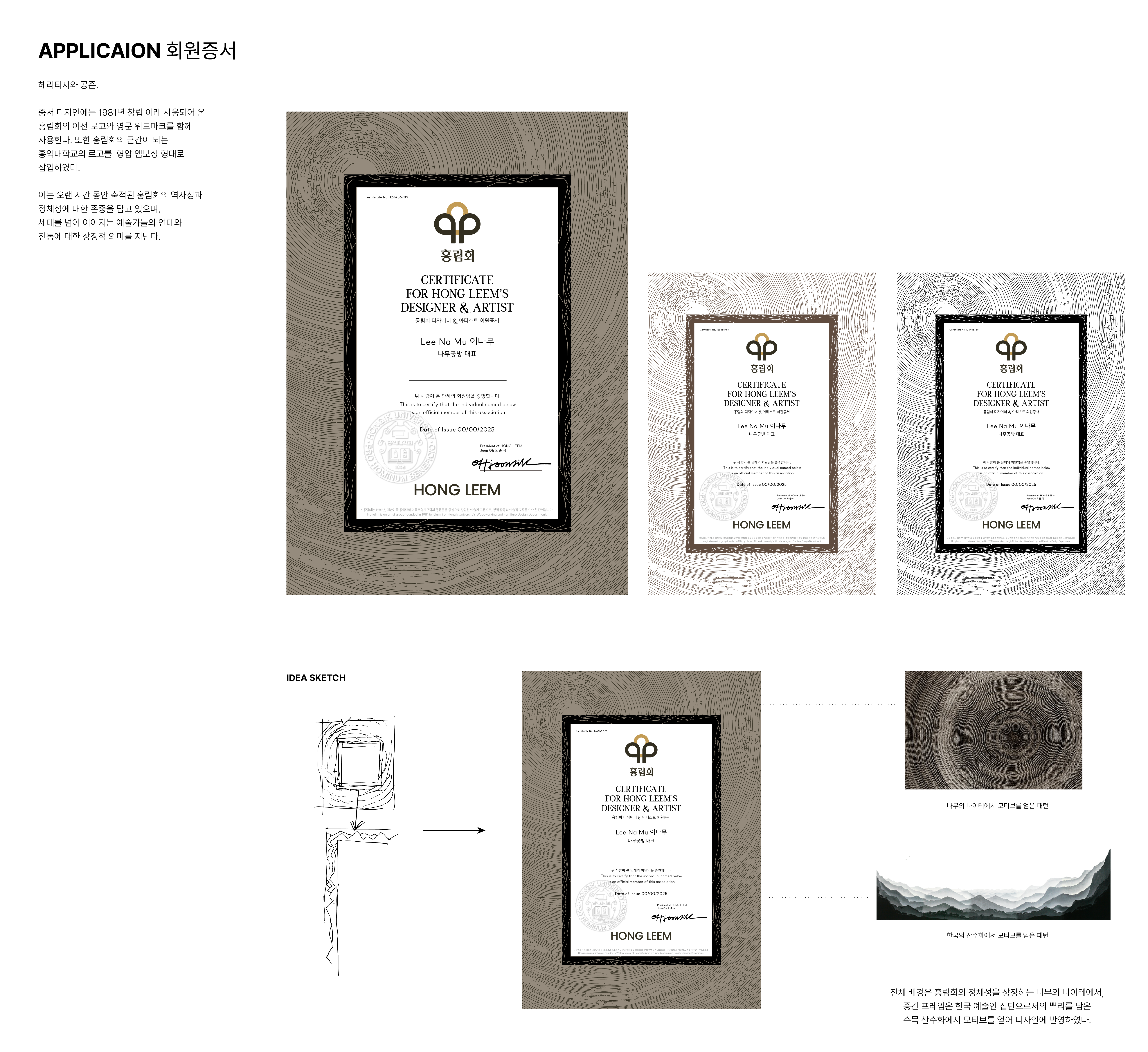
아이덴티티 재정비와 더불어 홍림회의 정체성을 담은 회원증서를 새롭게 개발하였습니다.
회원증서는 단순한 증명 문서를 넘어, 홍림회의 역사와 가치, 그리고 구성원으로서의 소속감을 상징하는 매개체로 기획되었습니다.
증서 디자인에는 1981년 창립 이후 사용되어 온 기존 홍림회의 로고와 새로 개발된 워드마크를 함께 적용하여, 시간의 흐름 속에서 축적된 헤리티지와 현재의 아이덴티티가 공존하도록 구성하였습니다. 또한 홍림회의 근간이 되는 홍익대학교와의 연결성을 상징하기 위해, 학교 로고를 형압(엠보싱) 요소로 삽입하여 상징성과 권위를 더하였습니다.
전체 그래픽은 나무의 나이테에서 착안한 패턴과 한국의 산수화에서 영감을 받은 조형 요소를 바탕으로 구성되었습니다. 나이테 패턴은 목공예와 가구 제작의 시간성과 축적된 장인정신을 상징하며, 산수화적 표현은 세대를 넘어 이어지는 예술가들의 연대와 흐름을 은유적으로 담아냅니다.
Alongside the identity renewal, a new membership certificate was developed to embody the core values and character of HONG LEEM.
The certificate was conceived not merely as a document of verification, but as a symbolic medium representing the association’s history, values, and the sense of belonging shared by its members.
The design incorporates both the original HONG LEEM logo, used since the association’s founding in 1981, and the newly developed wordmark, allowing the accumulated heritage of the past and the present identity to coexist within a single composition. To further emphasize the connection to Hongik University, which forms the foundation of HONG LEEM, the university’s emblem was applied as an embossed element, adding a sense of symbolism and formality.
The overall graphic composition draws inspiration from the growth rings of trees and the visual language of traditional Korean landscape painting. The tree-ring pattern symbolizes the passage of time and the accumulated craftsmanship inherent in woodworking and furniture making, while the landscape-inspired forms metaphorically express the continuity and solidarity of artists across generations.
RELATED WORKS ︎︎︎
VIEW OTHER WORKS I COMMUNICATION ︎︎︎
WE ARE HERE
Current time
베리준오 디자인센터
VJO Design Center
3F, 43, Mallijae-ro 35-gill, Jung-gu, Seoul, Korea
서울 중구 만리재로 35길 43, 3층 (04502)
+82 2 312 0280
hello@vjo.kr
베리준오 브랜드아키텍처
VJO Brand Architecture
베리준오 제주 아뜰리에
VJO Jeju Atelier
Jeju, South Korea
Design in Progress
© VJO. All rights reserved.