
2024 - 2025
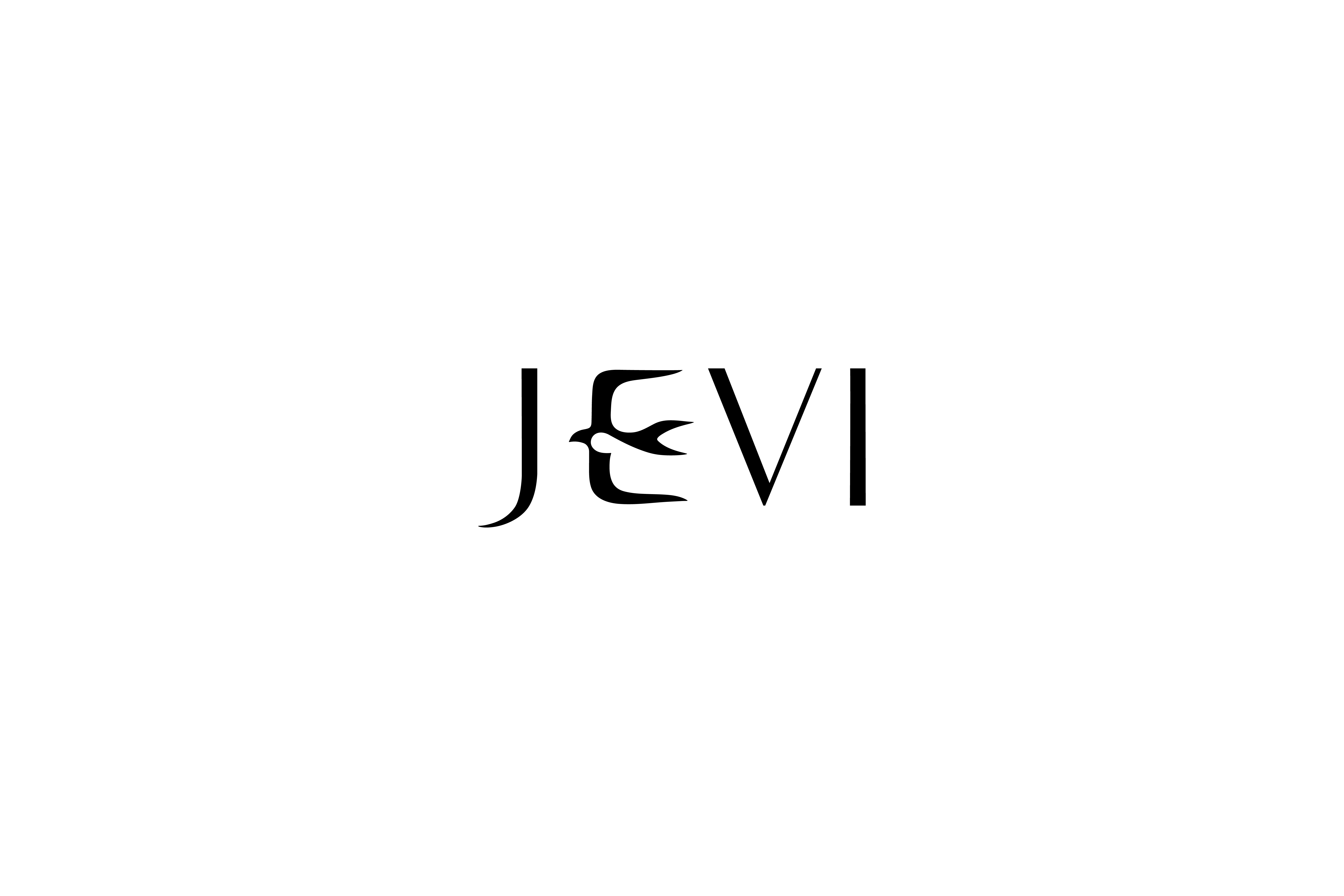
JEVI HANOK
제비한옥 브랜딩
CLIENT. VJO Design Center
︎ Branding

OVERVIEW.
제비한옥(JEVI HANOK)은 중림동에 위치한 한식당으로,
“제비가 봄과 함께 찾아와 복을 전하듯, 정성스레 준비한 음식으로 찾아주시는 모든 분께 행복을 전한다”는 마음을 담아 운영되고 있습니다.
제비한옥은 매 끼니를 통해 고객의 하루에 좋은 기운과 따뜻한 환대를 전달하는 공간을 지향합니다.
제비한옥(JEVI HANOK)은 중림동에 위치한 한식당으로,
“제비가 봄과 함께 찾아와 복을 전하듯, 정성스레 준비한 음식으로 찾아주시는 모든 분께 행복을 전한다”는 마음을 담아 운영되고 있습니다.
제비한옥은 매 끼니를 통해 고객의 하루에 좋은 기운과 따뜻한 환대를 전달하는 공간을 지향합니다.
JEVI HANOK, located in Jungnim-dong, is a Korean restaurant built on the belief that “just as swallows return with spring to bring good fortune, we hope to bring happiness to everyone who visits through the dishes we prepare with care.”
Each meal at JEVI HANOK is crafted to offer warmth, positive energy, and a sense of heartfelt hospitality to your day.


BRAND IDENTITY CONCEPT.
브랜드의 핵심 정서는 ‘행운을 가져오는 제비’라는 상징에서 출발합니다.
따뜻함, 진정성, 그리고 한국 고유의 미감을 현대적으로 표현하기 위해 로고 타입 JEVI에 제비 모티프를 조형적으로 결합했습니다.
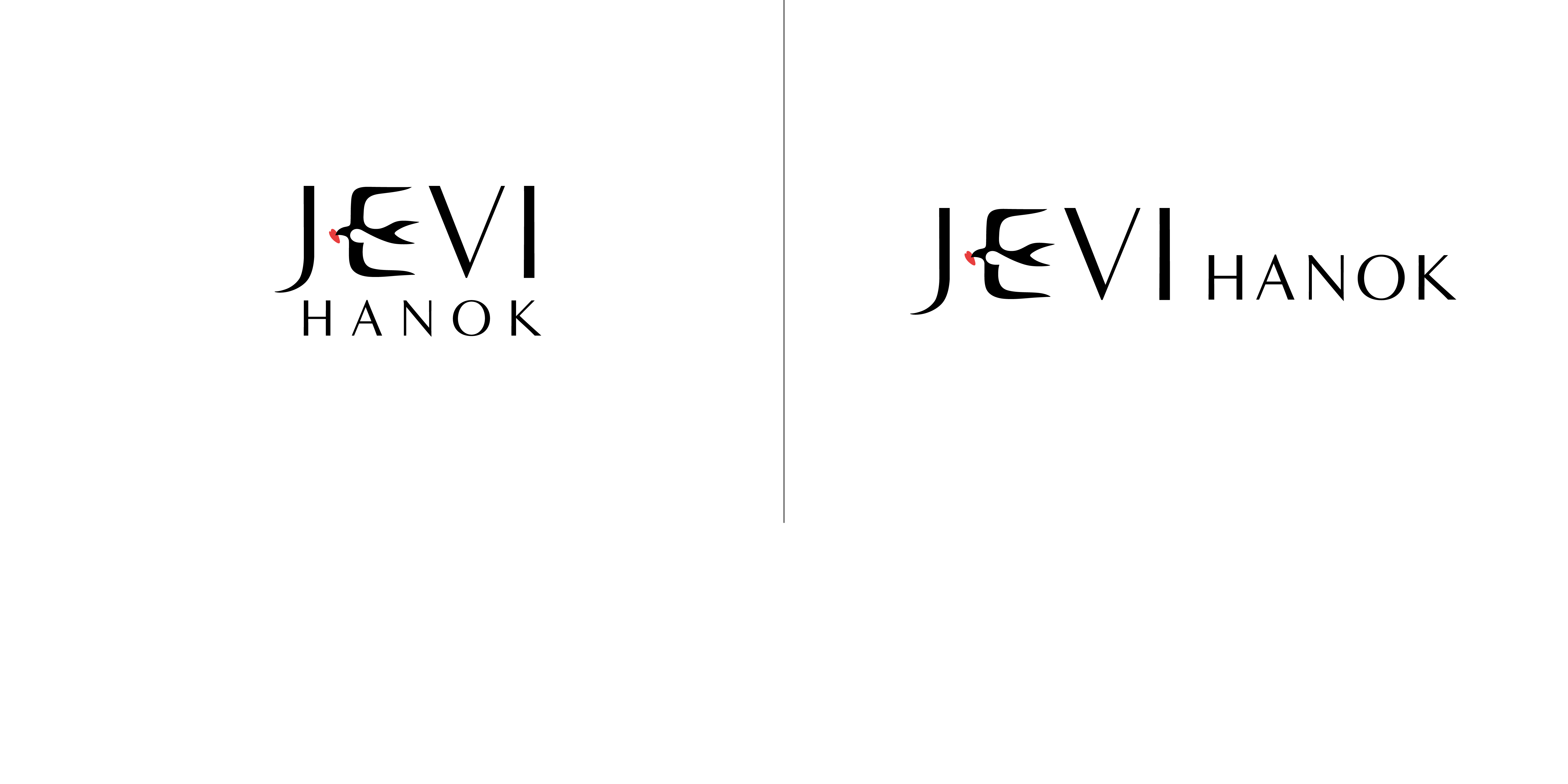
LOGO DESIGN.
로고의 중심 요소인 E는 제비의 실루엣을 기반으로 재해석되었습니다.
이 제비는 입에 박씨와 하트를 결합한 상징을 물고 있는데, 이는
박씨- 예로부터 ‘풍요와 복’을 가져다주는 상징 | 하트- 찾아오는 이들에게 전하고자 하는 ‘따뜻함과 정성’
을 의미합니다. 이를 통해 제비한옥이 추구하는 좋은 기운, 다정한 환대, 행복을 전하는 한 끼의 의미를 전달합니다.
브랜드의 핵심 정서는 ‘행운을 가져오는 제비’라는 상징에서 출발합니다.
따뜻함, 진정성, 그리고 한국 고유의 미감을 현대적으로 표현하기 위해 로고 타입 JEVI에 제비 모티프를 조형적으로 결합했습니다.
LOGO DESIGN.
로고의 중심 요소인 E는 제비의 실루엣을 기반으로 재해석되었습니다.
이 제비는 입에 박씨와 하트를 결합한 상징을 물고 있는데, 이는
박씨- 예로부터 ‘풍요와 복’을 가져다주는 상징 | 하트- 찾아오는 이들에게 전하고자 하는 ‘따뜻함과 정성’
을 의미합니다. 이를 통해 제비한옥이 추구하는 좋은 기운, 다정한 환대, 행복을 전하는 한 끼의 의미를 전달합니다.
The core sentiment of the brand begins with the symbol of the swallow that brings good fortune. To express warmth, sincerity, and a modern interpretation of Korean aesthetics, the swallow motif is visually integrated into the logotype JEVI.
The key element of the logo, the letter E, is reinterpreted based on the silhouette of a swallow. The swallow holds a symbol that combines a gourd seed and a heart which means
Gourd seed - a traditional emblem of abundance and blessings.
Heart - representing the warmth and sincerity offered to every guest.
Together, these elements convey the spirit of JEVI HANOK: sharing good energy, heartfelt hospitality, and the happiness delivered through every meal.
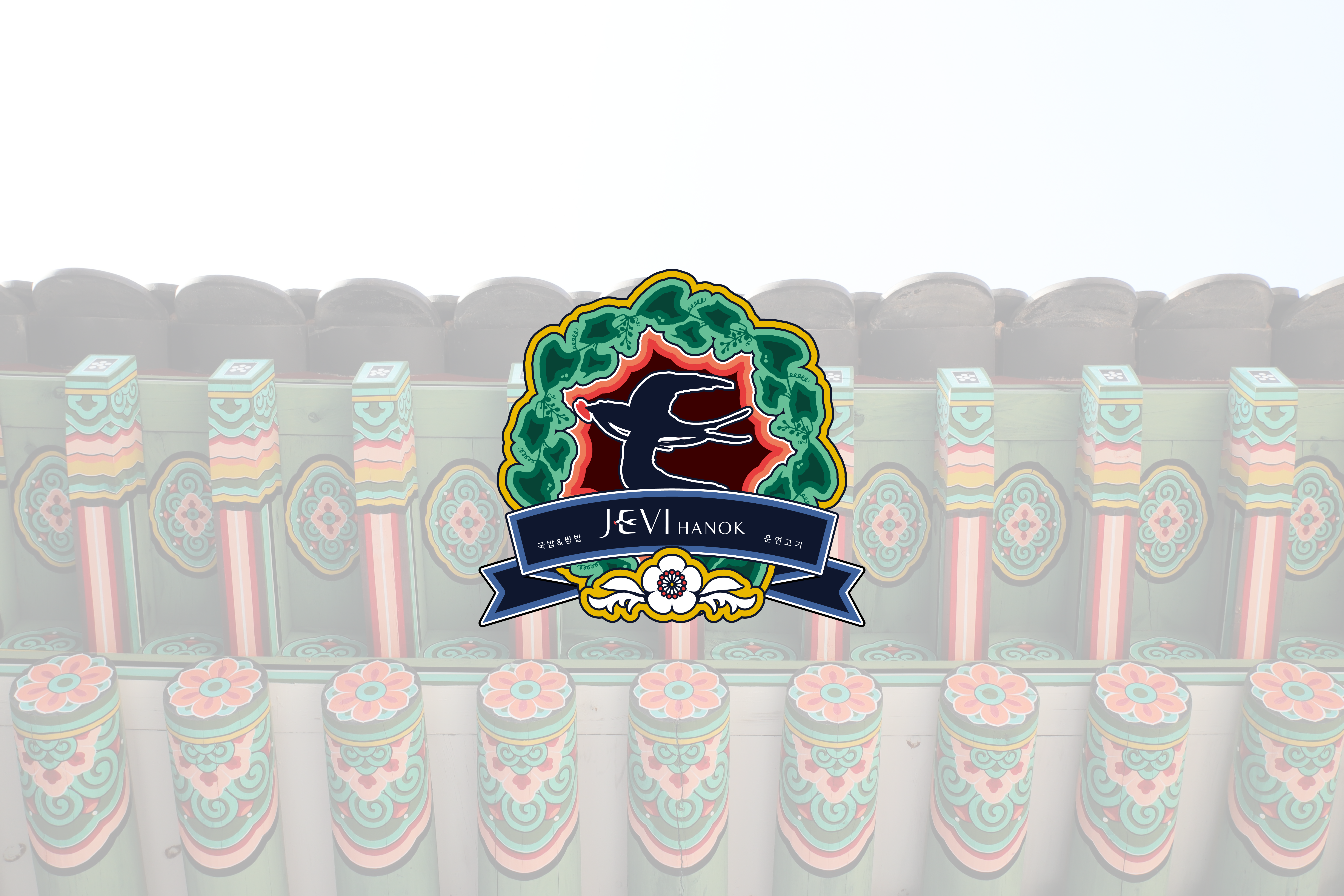
JEVI HANOK EMBLEM.
제비한옥의 아이덴티티를 확장한 이 엠블럼은, 브랜드의 핵심 상징인 ‘제비’ 로고를 기반으로 한국 전통 색채와 문양을 결합해 개발한 단청(丹靑) 스타일 그래픽 엠블럼입니다.
TRADITIONAL MOTIF & COLOR.
단청은 한국 목조건축에서 악귀를 떨치고 복을 부르기 위한 장식으로 사용되며,
화려한 색채와 상징적 패턴을 통해 공간에 생동감과 기운을 더하는 전통 예술입니다.
제비한옥 엠블럼은 이러한 단청의 의미를 차용해,
“행운을 불러오고 좋은 기운을 전하는 식당” 이라는 브랜드 철학을 보다 강하게 드러냅니다.
제비한옥의 아이덴티티를 확장한 이 엠블럼은, 브랜드의 핵심 상징인 ‘제비’ 로고를 기반으로 한국 전통 색채와 문양을 결합해 개발한 단청(丹靑) 스타일 그래픽 엠블럼입니다.
TRADITIONAL MOTIF & COLOR.
단청은 한국 목조건축에서 악귀를 떨치고 복을 부르기 위한 장식으로 사용되며,
화려한 색채와 상징적 패턴을 통해 공간에 생동감과 기운을 더하는 전통 예술입니다.
제비한옥 엠블럼은 이러한 단청의 의미를 차용해,
“행운을 불러오고 좋은 기운을 전하는 식당” 이라는 브랜드 철학을 보다 강하게 드러냅니다.
This emblem is an extension of JEVI HANOK’s visual identity, developed by combining Korean traditional colors and patterns with the brand’s signature swallow-shaped logo. Designed in the style of dancheong—the decorative painting found in traditional Korean wooden architecture—it visually expands the core symbolism of the brand.
Dancheong has long been used to ward off evil spirits and invite good fortune, adding vitality and auspicious energy to a space through its vibrant colors and symbolic motifs. The JEVI HANOK emblem draws on this meaning, expressing the brand’s philosophy as “a place that brings luck and positive energy” with even greater clarity.
Color Scheme

DESIGN INTENTION
JEVI HANOK의 아이덴티티는 전통적 의미를 현대적 미감으로 해석해
식당의 정체성(한식, 환대, 행운)을 직관적이면서도 세련되게 전달하도록 설계되었으며, 브랜드가 고객에게 전하고자 하는 ‘따뜻한 경험’을 명확히 표현합니다.
The identity of JEVI HANOK reinterprets traditional meanings through a modern aesthetic, delivering the restaurant’s core qualities—Korean cuisine, hospitality, and good fortune—in a way that feels both intuitive and refined. This identity clearly expresses the brand’s intention to offer guests a warm and welcoming experience.
RELATED WORKS ︎︎︎
VIEW OTHER WORKS I COMMUNICATION ︎︎︎
WE ARE HERE
Current time
베리준오 디자인센터
VJO Design Center
3F, 43, Mallijae-ro 35-gill, Jung-gu, Seoul, Korea
서울 중구 만리재로 35길 43, 3층 (04502)
+82 2 312 0280
hello@vjo.kr
베리준오 브랜드아키텍처
VJO Brand Architecture
베리준오 제주 아뜰리에
VJO Jeju Atelier
Jeju, South Korea
Design in Progress
© VJO. All rights reserved.