
2025
VERY KITCHEN
VERY KITCHEN
2025 NEW IDENTITY
베리키친 2025 뉴 아이덴티티
CLIENT. VJO Design Center
︎ Branding


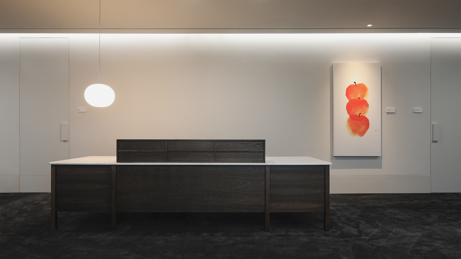
OVERVIEW.
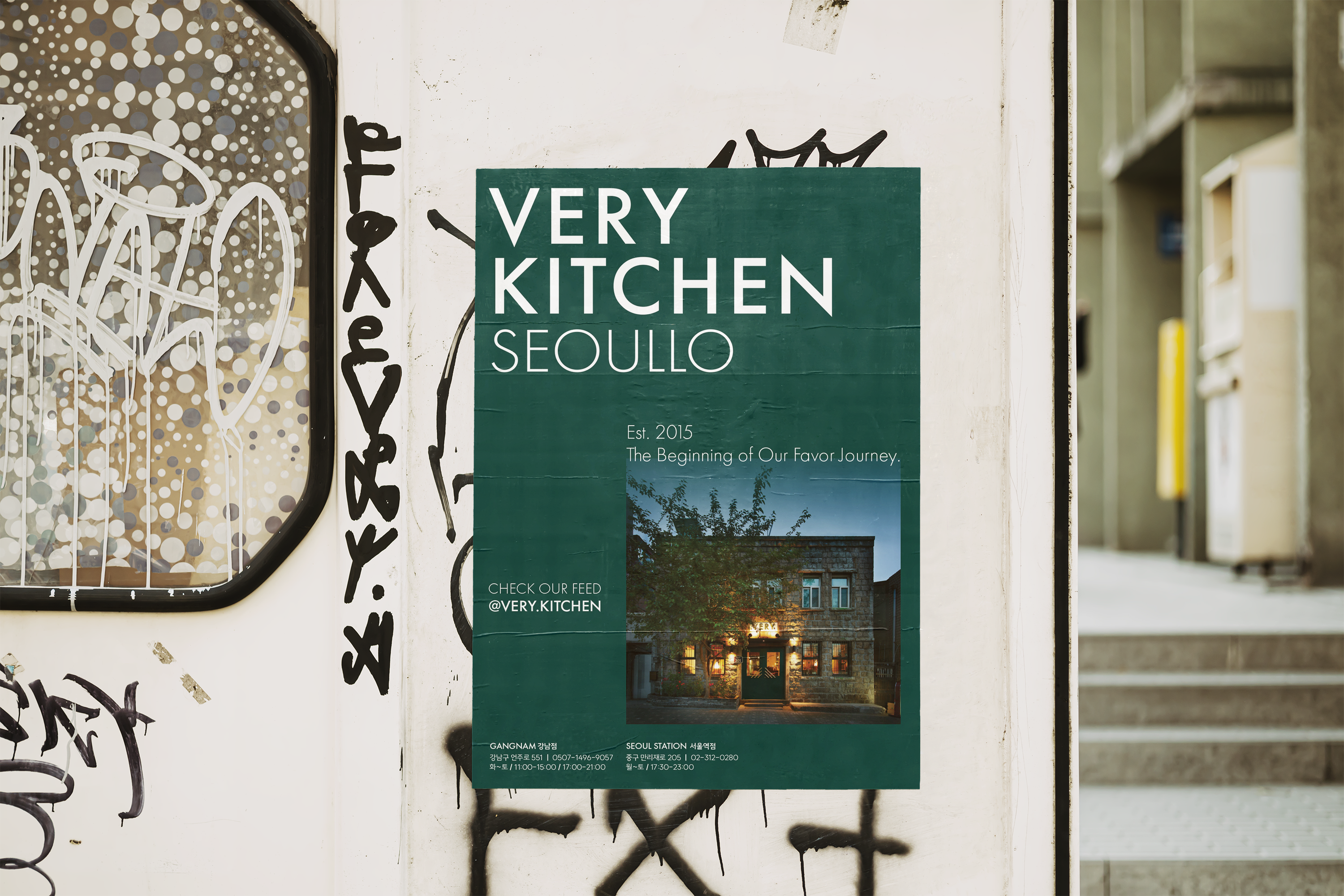
2015년 처음 문을 연 베리키친(VERY Kitchen)은 지난 10년 간 ‘한국과 프랑스의 감성을 결합한 다이닝 경험’을 중심으로 성장해 왔습니다. 2025년 10주년을 맞아, 서울 강남구 역삼동에 분점을 런칭하며 새로운 Brand Identity를 확립하게 되었습니다.
새로운 베리키친 BI는 브랜드명의 구조적 힘을 강조한 VERY와, 감성적이고 손맛을 상징하는 Kitchen의 대비를 통해
베리키친이 추구하는 감성을 시각적으로 표현합니다.
이번 리뉴얼은 단순한 시각적 변경을 넘어, 강남이라는 지역성과 10년간 쌓아온 브랜드 경험을 재해석하여
베리키친의 다음 10년을 위한 새로운 기준을 제시하는 작업입니다.
Founded in 2015, VERY Kitchen has spent the past decade growing around a dining experience that blends the sensibilities of Korea and France.
In celebration of its 10th anniversary in 2025, the brand is launching a new branch in Yeoksam, Gangnam, and establishing an updated Brand Identity.
The new BI highlights the structural strength of VERY and contrasts it with Kitchen, which conveys warmth, emotion, and the essence of hand-crafted cooking—visually expressing the sensibility that defines VERY Kitchen.
This renewal goes beyond a visual update; it reinterprets the locality of Gangnam and the brand experience accumulated over the past ten years, setting a new standard for VERY Kitchen’s next decade.
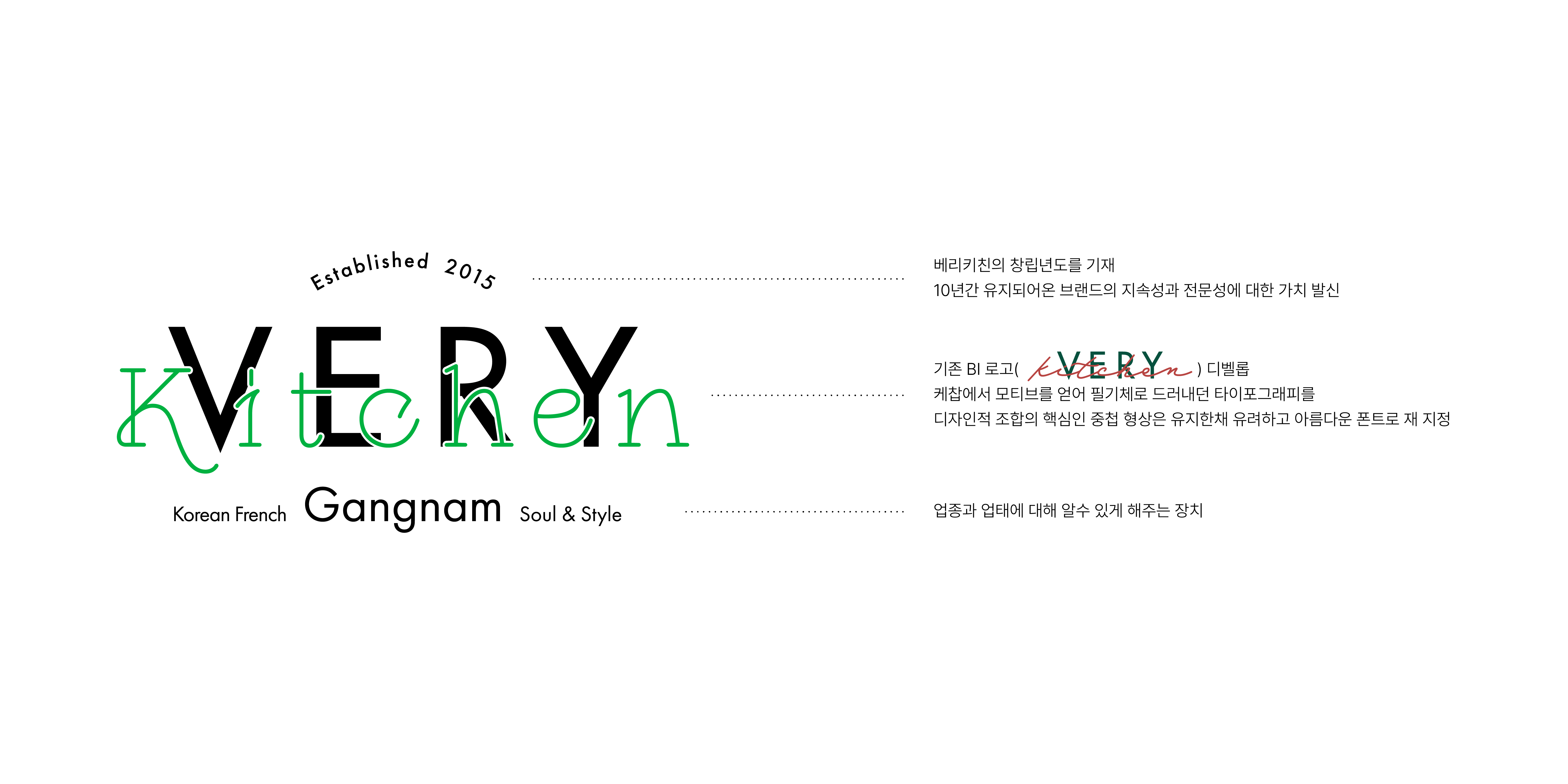
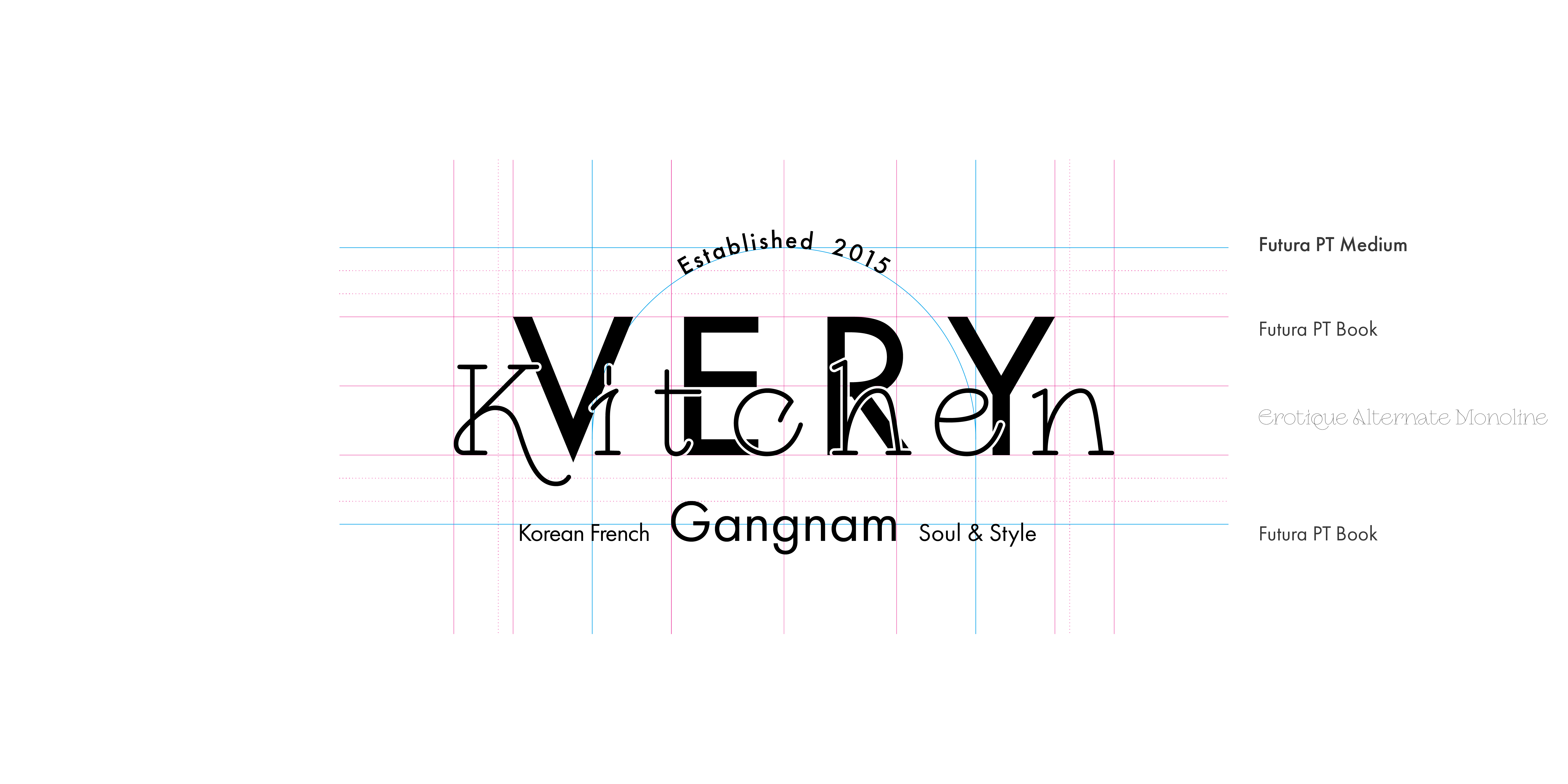
SIGNATURE LOGO DEVELOPMENT.
기존 BI를 기반으로 조형적 요소를 재정리하여 브랜드가 가진 감성과 스토리텔링이 균형 있게 드러나는 형태로 개발되었습니다.
이는 베리키친의 10주년을 넘어, 이후에도 일관되게 확장 가능한 새로운 디자인 시스템의 기준점으로 기능합니다.
기존 BI를 기반으로 조형적 요소를 재정리하여 브랜드가 가진 감성과 스토리텔링이 균형 있게 드러나는 형태로 개발되었습니다.
이는 베리키친의 10주년을 넘어, 이후에도 일관되게 확장 가능한 새로운 디자인 시스템의 기준점으로 기능합니다.
Building on the previous BI, the visual elements were reorganized and refined to create a form that balances the brand’s sensibility and storytelling.
This updated structure serves as a foundation for a new design system—one that extends beyond VERY Kitchen’s 10th anniversary and can continue to grow consistently in the years ahead.

KOR Ver.

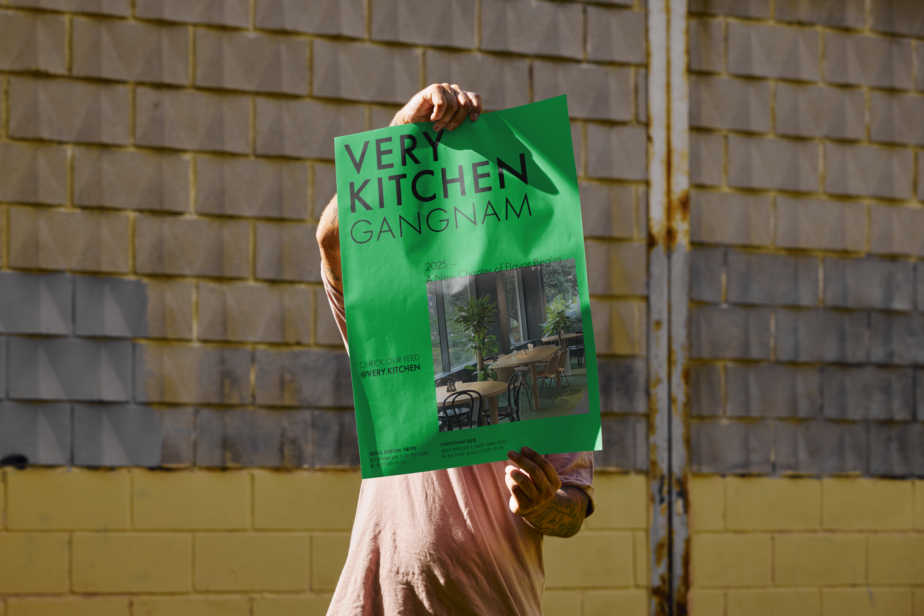
REGIONAL SIGNATURE SYSTEM.
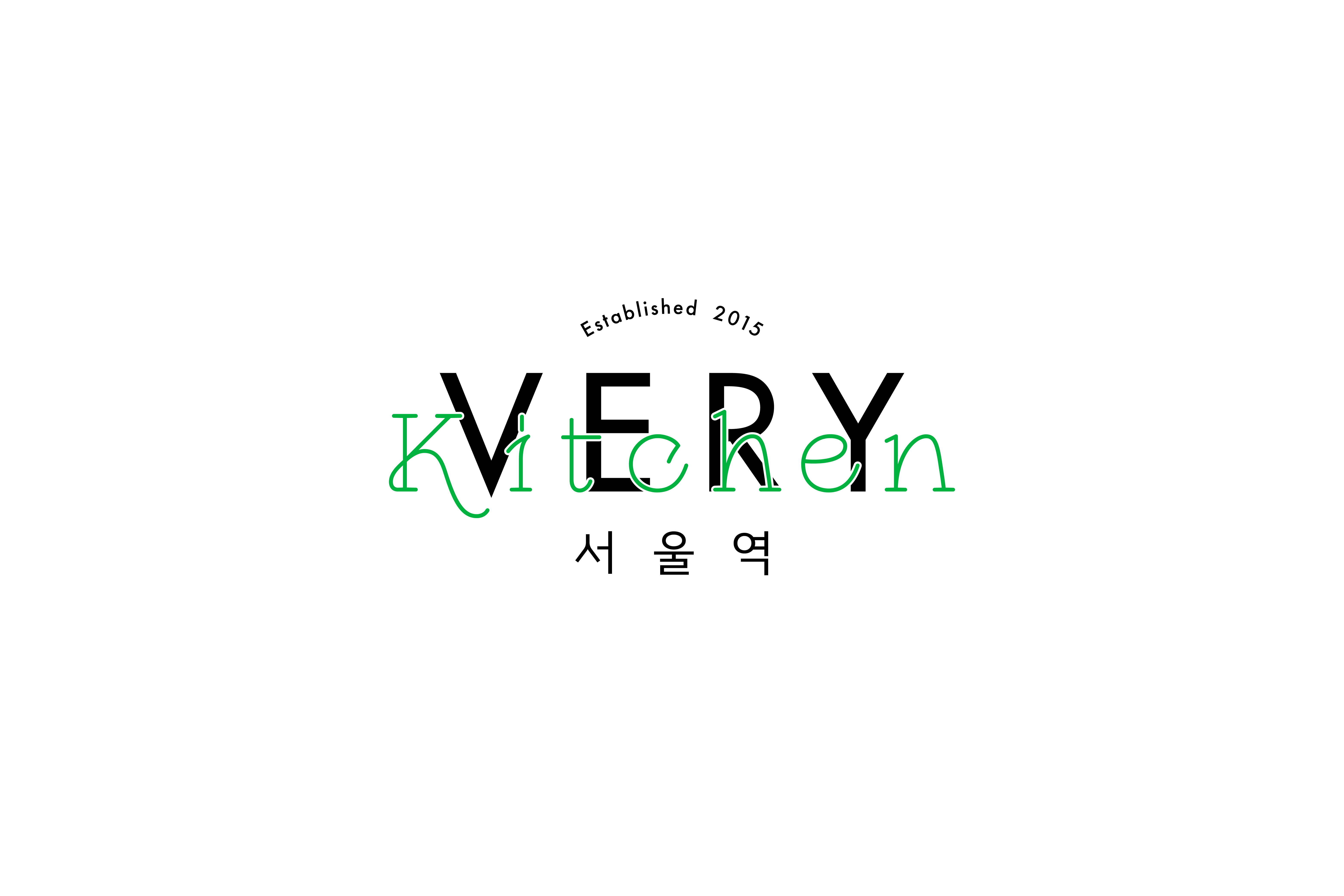
새 BI는 지점별 정체성을 표현하기 위해 지역명을 결합한 국문형 시그니처를 함께 개발했습니다.
각 버전은 메인 로고의 구조를 유지하면서, 하단에 지역명을 국문으로 배치해 지점 인지가 쉽도록 구성했습니다.
지역명은 균형감 있는 고딕체로 적용해 브랜드 전체의 통일성과 확장성을 확보하였습니다.
새 BI는 지점별 정체성을 표현하기 위해 지역명을 결합한 국문형 시그니처를 함께 개발했습니다.
각 버전은 메인 로고의 구조를 유지하면서, 하단에 지역명을 국문으로 배치해 지점 인지가 쉽도록 구성했습니다.
지역명은 균형감 있는 고딕체로 적용해 브랜드 전체의 통일성과 확장성을 확보하였습니다.
To express the identity of each location, the new BI includes a Korean signature system that combines the brand name with the name of the specific branch.
Each version maintains the structure of the main logo while placing the regional name in Korean beneath it for clear and immediate recognition.
The regional descriptors are set in a balanced gothic typeface, ensuring both consistency and scalability across the entire brand.
RELATED WORKS ︎︎︎
VIEW OTHER WORKS I COMMUNICATION ︎︎︎
WE ARE HERE
Current time
베리준오 디자인센터
VJO Design Center
3F, 43, Mallijae-ro 35-gill, Jung-gu, Seoul, Korea
서울 중구 만리재로 35길 43, 3층 (04502)
+82 2 312 0280
hello@vjo.kr
베리준오 브랜드아키텍처
VJO Brand Architecture
베리준오 제주 아뜰리에
VJO Jeju Atelier
Jeju, South Korea
Design in Progress
© VJO. All rights reserved.